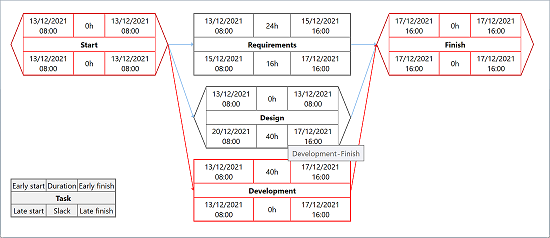
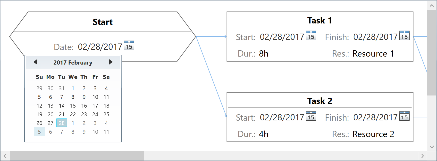
NetworkDiagramView component displays tasks and dependencies using a Network Diagram similar to that of the classic PERT review technique. Supports rearranging items using drag and drop operations, computing values based on items displayed by existing GanttChartDataGrid component instances, and custom element templates.

-
WPF +
C#Demo<pdpcc:NetworkDiagramView x:Name="NetworkDiagramView"> … </pdpcc:NetworkDiagramView>var items = new ObservableCollection<NetworkDiagramItem> { new NetworkDiagramItem { DisplayedText = "Task 1", Content = "First task", … }, new NetworkDiagramItem { DisplayedText = "Task 2", Content = "Second task", … }, … }; items[1].Predecessors.Add(new NetworkPredecessorItem { Item = items[0] }); … NetworkDiagramView.Items = items; … -
WPF +
Visual Basic®<pdpcc:NetworkDiagramView x:Name="NetworkDiagramView"> … </pdpcc:NetworkDiagramView>Dim items = New ObservableCollection(Of NetworkDiagramItem) From { _ New NetworkDiagramItem With { .DisplayedText = "Task 1", .Content = "First task", … }, _ New NetworkDiagramItem With { .DisplayedText = "Task 2", .Content = "Second task", … }, _ … _ } items(1).Predecessors.Add(New NetworkPredecessorItem With { .Item = items(0), … }) … NetworkDiagramView.Items = items … -
Silverlight™ +
C#Demo<pdpcc:NetworkDiagramView x:Name="NetworkDiagramView"> … </pdpcc:NetworkDiagramView>var items = new ObservableCollection<NetworkDiagramItem> { new NetworkDiagramItem { DisplayedText = "Task 1", Content = "First task", … }, new NetworkDiagramItem { DisplayedText = "Task 2", Content = "Second task", … }, … }; items[1].Predecessors.Add(new NetworkPredecessorItem { Item = items[0] }); … NetworkDiagramView.Items = items; … -
Silverlight™ +
Visual Basic®<pdpcc:NetworkDiagramView x:Name="NetworkDiagramView"> … </pdpcc:NetworkDiagramView>Dim items = New ObservableCollection(Of NetworkDiagramItem) From { _ New NetworkDiagramItem With { .DisplayedText = "Task 1", .Content = "First task", … }, _ New NetworkDiagramItem With { .DisplayedText = "Task 2", .Content = "Second task", … }, _ … _ } items(1).Predecessors.Add(New NetworkPredecessorItem With { .Item = items(0), … }) … NetworkDiagramView.Items = items …
Items collection
To load and present data with NetworkDiagramView control, initialize the Items collection of the component, setting up NetworkDiagramItem objects representing tasks identified by these main properties: DisplayedText, Content, EarlyStart, LateStart, EarlyFinish, LateFinish, Effort, IsMilestone, Slack, and Predecessors. Predecessors collection (objects of type NetworkPredecessorItem) represents task dependencies and are identified by these properties: Item.
DisplayedText values should be short inline entity titles, while Content values are displayed as chart shape tool tips.
End users may use drag and drop operations to update shape positioning, if needed, in order to make the diagram fitting better to their own needs. You may also easily position items in code, setting their DisplayedRowIndex and DisplayedColumnIndex property values considering a virtual grid as the container of the elements.
You may set an ID or GUID for any item object as Key and GlobalKey property values, useful when mapping to relational data storage access layers. A generic Tag property is also available to support miscellaneous object linking scenarios. Note that you can also prepare items for NetworkDiagramView component from a GanttChartDataGrid instance using GetNetworkDiagramItems method.
var items = GanttChartDataGrid.GetNetworkDiagramItems();
NetworkDiagramView.Items = items;
Data binding
Although we designed the component to support items of specific types only (NetworkDiagramItem) to ensure high runtime performance, you may use our built-in collection converter (NetworkTaskItemsConverter) to set up data binding to custom collection types with ease. Alternatively, you can use a fully custom converter to provide collection synchronization upon your own needs.
The component is persistence layer independent, so you can bind it to data collections from virtually any data source, including but not limited to SQL Server® databases.
To be notified when items managed by the component change, simply handle the ItemCollectionChanged and ItemPropertyChanged events.
-
WPF
-
Silverlight™
Appearance and shape templating
You may fully customize item appearance, either for the entire chart or for individual entries in the view, using attached properties such as NetworkDiagramView.ShapeFill, ShapeStroke, MilestoneShapeFill, etc.
The component offers built-in critical path enumeration algorithms for tasks and their dependencies, and you can use the appearance settings to highlight them according to your requirements.
And when you need to develop advanced features in your application, diagram shapes may be fully redesigned using XAML based template for TaskTemplate property of the component. Of course, this way you can add custom editors for different fields of the task items, as required in your application.
-
WPF
-
Silverlight™

Printing and image exporting
The component offers a Print method that may be called to initiate a direct print operation for its content. A custom PrintingTemplate definition that you can specify using XAML is repeatedly used when generating the printed pages.
Moreover, you can export scalable images of the component content by calling GetBitmapSource method on the fly. For example, you may then encode an output image to an external file format such as PNG, include the image into an element displayed in a custom printed document, or simply displaying it as read only content on the screen.
NetworkDiagramView.Print("Sample Document");
NetworkDiagramView.Export((Action)delegate
{
    SaveFileDialog saveFileDialog =
        new SaveFileDialog { Title = "Export Image To", Filter = "PNG image files|*.png" };
    if (saveFileDialog.ShowDialog() != true)
        return;
    BitmapSource bitmapSource = NetworkDiagramView.GetExportBitmapSource(96 * 2);
    using (Stream stream = saveFileDialog.OpenFile())
    {
        PngBitmapEncoder pngBitmapEncoder = new PngBitmapEncoder();
        pngBitmapEncoder.Frames.Add(BitmapFrame.Create(bitmapSource));
        pngBitmapEncoder.Save(stream);
    }
});
Windows® Forms
You may use the WPF component in Windows® Forms applications using Microsoft® ElementHost control from WindowsFormsIntegration assembly of .NET 4+.
Optionally, you can define a XAML user control in your Windows® Forms project to serve for encapsulation.
var items = …;
var host = new ElementHost
{
    Child = new NetworkDiagramView
    {
        Items = items,
        …
    },
    Dock = DockStyle.Fill
};
Controls.Add(host);
