DlhSoft Gantt Chart Light Library
LightSwitch® 2012/2013 Extensions
Documentation
Prerequisites
To install and use the Silverlight™ based LightSwitch® extensions for DlhSoft Gantt Chart Light Library you need:
· Microsoft® Visual Studio® 2012 or 2013;
·
Silverlight™
5 target set up for your LightSwitch® application project(s).
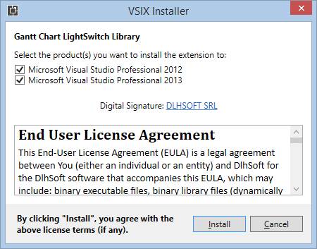
Installation
To install the Silverlight™ based LightSwitch® extensions for DlhSoft Gantt Chart Light Library please follow these steps:
· Run DlhSoft.GanttCharts.vsix file included within this package;
o VSIX Installer should start automatically, and initialize its dialog window.
·
Select the Visual
Studio versions you would like to install the package for and click Install:
Get Started
To use the Silverlight™ based LightSwitch® extensions for DlhSoft Gantt Chart Light Library please follow these steps:
· Open your Silverlight™ based LightSwitch® application project in Visual Studio®;
o Note: A complete sample application is available, allowing you to test the features of the product extensions if you don’t already have a LightSwitch® application project:
§ Find the GanttChartSample.zip file within the Samples folder;
§ Extract the archive contents to a folder on your computer and open the solution in Visual Studio®;
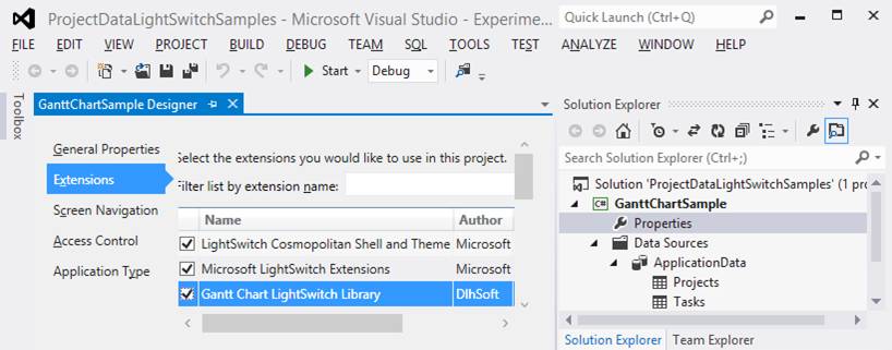
·
In Visual
Studio® project’s Properties
(open it from the context menu of the project Properties entry in Solution
Explorer), select the Extensions
section, and ensure that DlhSoft.GanttCharts
extension is available and referenced in your application (select its check
box):
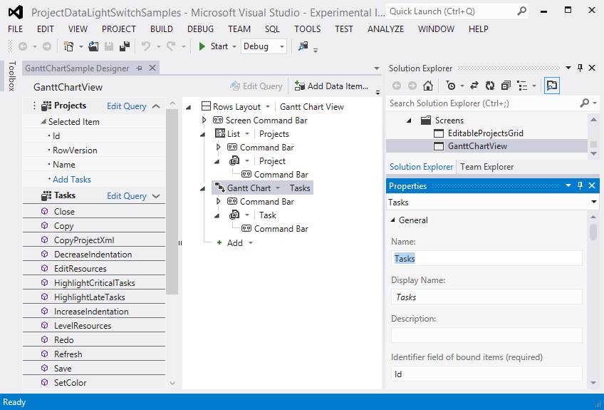
·
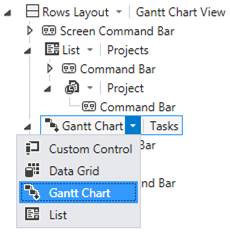
In Editable
Grid screens displaying collections
of task entity items using row layout,
you may select Gantt Chart control
type instead of List or Data Grid:
· Ensure that the Gantt Chart extension component properties are set up correctly for your data set (see Configuration section below for more details):
o Set the required data binding field names to indicate appropriate and correctly typed entity item properties from your data source;
o Set the other properties according to your application requirements.
·
Build and run the application, and navigate to
the Gantt Chart enabled screens to
test functionality; if needed, go back to the previous step and perform further
configuration according to your change requirements:
· Note: Without a DlhSoft license set up as indicated in the following section, the application may display nag screens periodically, indicating that you are only allowed to test the product, and not use it in production.
Configuration
To configure the Silverlight™ based LightSwitch® extensions for DlhSoft Gantt Chart Light Library in your application please follow these steps:
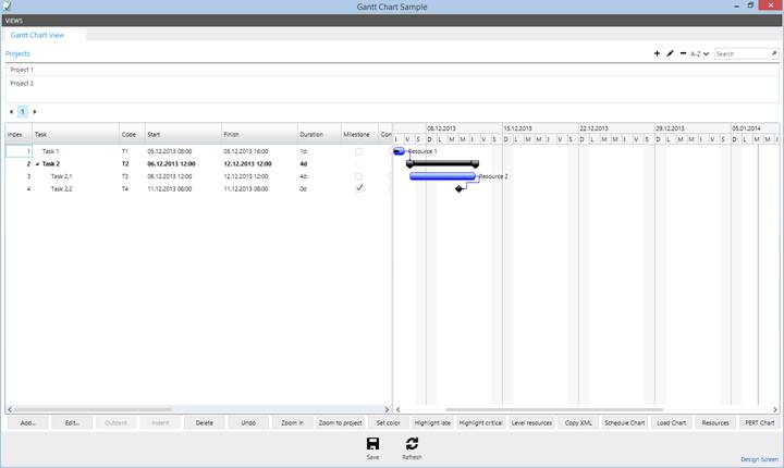
·
Select the Gantt
Chart component you need to configure in the Screen designer:
· In Properties window (accessible from the component context menu), configure the specific component settings as necessary:
o Identifier field of bound items (required):
§ Represents the name of the identifier (primary key) property of your task entities.
§ The referenced entity property must exist and its values must be of Integer type and defined as required for the entity table.
§ It is used to identify the tasks in the collection, including when storing predecessor relations (dependency lines) set up in the Gantt Chart.
§ Task IDs are displayed in a column of the associated data grid if Item ID Visibility check box is checked (in Appearance properties of the component).
o Indentation field of bound items:
§ Represents the name of the indentation property of your task entities, when provided.
§ When set, the referenced entity property must exist and their values must be of Integer type and defined as required for the entity table.
§ It is used to set up the hierarchical collection representing the project structure displaying task names as a tree.
§ Alternatively, you may use an empty string value to indicate that indentation is not provided and nor managed by the component; in this case the task collection will be flat.
o Name field of bound items (required):
§ Represents the name of the content property of your task entities, indicating the task names, codes, or other displayed indicatives.
§ The referenced entity property must exist and its values should be of (or convertible to) String type.
§ Task names are displayed in the hierarchical data grid, and as tool tips when hovering Gantt Chart bars or dependency lines.
o Start time and Finish time fields of bound items (required):
§ Represent the names of the start and finish properties of your task entities, indicating the task start and finish dates and times.
§ The referenced entity properties must exist and their values must be of Date Time or Date type and defined as required for the entity table.
§ Task start and finish dates and times are displayed in the data grid, and are used to set up the associated task bars horizontally in the Gantt Chart; the end user may drag and drop task bars and their ends horizontally to update task start and finish times.
o Completion time indicator field of bound items:
§ Represents the name of the completion indicator property of your task entities, indicating the task completion date and time, when provided.
§ When set, the referenced entity property must exist and its values must be of Date Time or Date type and defined as required for the entity table.
§ When set, task completion dates and times are used to set up the associated task completion bars horizontally in the Gantt Chart, within the main task bars, and completion percentages are displayed in the data grid, along with check boxes allowing setting full completion, when needed; the end user may also drag and drop task completion bar ends horizontally to update task completion times.
o Milestone indicator field of bound items:
§ Represents the name of the milestone indicator property of your task entities, indicating whether the task is a milestone, when provided.
§ When set, the referenced entity property must exist and its values must be of Boolean type and defined as required for the entity table.
§ When set, milestone tasks are displayed as diamond shapes in the Gantt Chart that do not have separate start and finish date and times (i.e. finish values are the same as start values), and tasks can be set or unset as milestones using check boxes displayed in the data grid.
o Assignments field of bound items:
§ Represents the name of the assignments property of your task entities, indicating the resources assigned to the task, and optionally their allocation percents.
§ When set, the referenced entity property must exist and its values should be of (or convertible to) String type and use this syntax: Resource 1 [allocation%], Resource 2 [allocation%], …; for example: Resource 1, Resource 2 [50%].
§ When set, the task assignments are displayed in the data grid, and also to the right side of the associated Gantt Chart bars.
o Predecessors field of bound items:
§ Represents the name of the predecessors property of your task entities, indicating the task dependencies, and optionally their types (abbreviated) and/or lags (in hours).
§ When set, the referenced entity property must exist and its values must be of String type and use this syntax: ID 1 [FS|SS|FF|SF] [[+|-]lag], ID 2 [FS|SS|FF|SF] [[+|-]lag], ...; for example: 101, 102SS+8.
§ When set, the task predecessors are displayed in the data grid using indexes in the collection instead of IDs (one based), and also as dependency arrow lines between associated Gantt Chart bars.
o Estimated start time and finish time fields of bound items:
§ Represent the names of the estimated start and finish properties of your task entities, indicating the baseline task start and finish dates and times, when provided.
§ When set, the referenced entity properties must exist and their values must be of Date Time or Date type; non-required (nullable) values are accepted.
§ Task estimated start and finish dates and times are displayed in the data grid, and are used to set up the associated baseline task bars horizontally in the Gantt Chart (using dotted lines).
o Working week start and finish days and day times:
§ Define the working time of the week and day.
§ Nonworking time of the day is not displayed by the component.
§ Nonworking days of the week are displayed and highlighted in the Gantt Chart when Entire week visibility check box is set (in Appearance properties of the component).
§ Date and times of the tasks are constrained to working times automatically.
o Auto scheduling and resource leveling:
§ When set, configures the component to automatically reschedule tasks as required by their dependencies (predecessor settings), and/or to automatically level resources as needed so that they are not over-allocated (as much as possible).
§ No circular dependencies are allowed when any of these properties are set.
§ These settings may affect application performance when using large sets of data.
o Custom fields:
§ Represents a list of supplemental task entity properties of your task entities to be managed by the component (fields that need to be considered read only being marked by asterisks), and optionally having format and control type definition strings, when provided.
§ When set, the referenced entity properties must exist, and this syntax should be used: Field 1* [control type] {format}, Field 2* [control type] {format}, …; for example: Code*, Description, CustomDate [d] {g}.
§ Supported control types are:
· [t] – text box: default control type, allowing the user to view and, when the column is not set as read only, edit the value using the specified or default format for the bound data type;
· [d] or [g] – date picker: allows entering Date or Date Time values, automatically applying {d} or {g} format settings accordingly, if not specifically defined, indicating date only or date and time including hours and minutes; when the field is specified as not required by the data table definition the initial (null) values are presented as a “N/A” texts and as an initially clear date picker selections upon editing;
· [b] – check box: allows entering Boolean values by checking or clearing the box; when the field is specified as not required by the data table definition the initial (null) values are presented as horizontal lines within check boxes;
· [c: choices] – combo box: allows selecting single String values from a set of pre-defined choices; to define the available field choices, this syntax should be used: choice 1 | choice2 | …; for example: [c: Internal | External | Global].
§ When no control type is specified for a specific field, or when the control type is not a check box and the end user hasn’t yet entered the edit mode for the cell, its value is displayed as a text block, using the specified format, if provided, and the actual editor control is shown upon clicking the cell or entering it with the keyboard focus.
§ Values are converted to display strings and back to original types (when not set as read only) automatically, using the specified format definition if provided.
§ Custom fields are presented as specific columns appended to the right side of the data grid, and are further configurable using the Column header, widths, and display indexes property, referring them in order, after the main columns.
o Column headers, widths, and display indexes:
§ Represents a list of column headers, and optionally widths (device independent unit based) and/or display indexes (one based) to be set for the data grid, when provided.
§ The string should use this syntax: Header 1 [width] {display index}, Header 2 [width] {display index}, …; for example: ID [50], Index [50], Task [160], Start [140], Duration [80], Finish [140] {5}, ….
§ The string should list entries for all defined columns (or for a left side subset of them), including for those that are hidden at runtime, as these settings are applied by following the column order indexes; column headers may be empty strings, if needed.
§ Both initial width and minimum width values are set for the columns when a width is specified beside a header; negative widths will hide the associated columns.
§ Display indexes are set in order, from left to right, and therefore any specified display index will refer to the already loaded columns from the left side of the definition string (you should not set display indexes to values larger than the storage index of the column in the collection); you may set two display indexes to the same value and in this case the second column with the same display index will be displayed first, as it will move before the previously set one.
§ Headers should be set first for main columns, and then for custom field columns; by default, custom field based columns will have headers identical to the referenced entity property names.
o Item ID and index visibility:
§ Indicate whether the ID and Index columns should be visible in the data grid.
§ You should display IDs whenever you want to display task Predecessors string outside of the component, such as in an Edit details screen (internally the component itself lists predecessors by index).
o Other appearance properties.
·
Finally, add command buttons in the Command Bar section of the Gantt Chart component instance of the Screen designer, writing appropriate
code to handle execution:
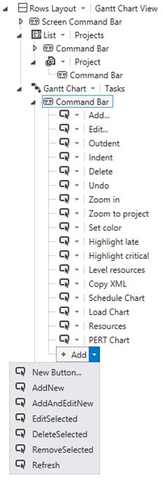
· Note that you may also define commands for which you don’t set up buttons in the Command Bar; you can execute them later from other code in your application (assuming having access to the component instance);
·
In your command execution code, you may
reference the data bound task entities as usual, accessing them using the name
set for the component instance:
var task = Tasks.SelectedItem;
[…]
·
Supplementary, if you need to access the base Silverlight™
control displayed by the Gantt Chart component and use its internal features,
handle the Created event of the
screen and set up an internal ControlAvailable
event handler for the LightSwitch®
component, using Control argument of
the event to reference it internally:
partial void GanttChartView_Created()
{
var tasks = this.FindControl("Tasks");
tasks.ControlAvailable += (sender, e) => { InitializeBaseControl(e.Control); };
}
GanttChartDataGrid BaseControl;
void InitializeBaseControl(object control)
{
BaseControl = control as GanttChartDataGrid;
if (BaseControl == null)
return;
[…]
}
·
Note that if you need to access the base control
from command execution code, you might need to access its features through its Dispatcher object, using BeginInvoke method, to address any
inherent LightSwitch®/Silverlight™ thread access issues that may otherwise
occur:
partial void ZoomIn_Execute()
{
if (BaseControl == null)
return;
BaseControl.Dispatcher.BeginInvoke(() =>
{
BaseControl.HourWidth *= 2;
}
}
·
Also note that some features of the base control
require Silverlight™ dialog window showing permission, which may be obtained by
executing custom code as Click event
handlers of your screen buttons and links instead of Execute event handlers for standard commands:
partial void GanttChartView_Created()
{
[…]
var printCommandButton = this.FindControl("Print");
if (printCommandButton != null)
printCommandButton.ControlAvailable += (sender, e) => {
InitializePrintButton(e.Control); };
}
void
InitializePrintButton(object control)
{
var printButton = control as ButtonBase;
if (printButton == null)
return;
printButton.Click += (sender, e) =>
{
if (BaseControl != null)
return;
BaseControl.Print("Gantt Chart");
};
}
·
Occasionally you may want to also create
instances of unbound Gantt Chart
Silverlight™ controls or of other related Silverlight™ component types (such as
Schedule Chart, Load Chart, PERT Chart,
or Network Diagram) that we don’t
provide direct LightSwitch® extensions for, and display them in child windows:
partial void ShowScheduleChart_Execute()
{
if (BaseControl == null)
return;
BaseControl.Dispatcher.BeginInvoke(()
=>
{
[…]
var scheduleChartItems = BaseControl.GetScheduleChartItems();
ChildWindow scheduleChartWindow =
new ChildWindow
{
Title = "Schedule Chart",
[…],
Content = new ScheduleChartDataGrid
{
Items =
scheduleChartItems, […]
}
};
scheduleChartWindow.Closed += (sender, e) => {
BaseControl.UpdateChangesFromScheduleChartItems(scheduleChartItems);
BaseControl.DisposeScheduleChartItems(scheduleChartItems);
};
scheduleChartWindow.Show();
});
}
Licensing
Installing a usage license for the main DlhSoft Gantt Chart Light Library product will not work with the LightSwitch® extension based applications. To apply the XML license content to your LightSwitch® application and remove nag screens please follow these steps:
· Open your LightSwitch® solution in Visual Studio®, expand Screens in Solution Explorer and open the designer for the Gantt Chart enabled screen in your application;
· Select Write Code combo box from the top-right of the designer window, and select the Run event to add code for (e.g. GanttChartView_Run method); an event handler will be created in your Application class (defined by Application code behind file in UserCode folder of your Client application project) and the code you’ll add there will run upon application initialization, i.e. before the Gantt Chart screen is accessed;
· In your LightSwitch® application’s initialization code (i.e. in the handler method you’ve just created for the Run event of the screen), configure a DlhSoft SetLicense method call, using the component namespace (assuming C# language is used for development):
DlhSoft.GanttCharts.Presentation.Controls.Licensing.GanttChartDataGrid.SetLicense("[...]");
o Occasionally, you might also use other Silverlight™ control instances in your LightSwitch™ application; to apply licensing for these components, use this method call in the application’s initialization code, replacing Component with the actual referenced type name (such as ScheduleChartDataGrid, LoadChartView, etc.):
DlhSoft.Windows.Controls.Licensing.Component.SetLicense("[...]");
· Fill in the entire content of the license XML file received from DlhSoft instead of the ellipsis area(s) above, directly in code and escaping doubling quotes inside the XML content as required by the programming language (or reading it from a resource file you configure in your application yourself).
o To extract the content from the XML license file, open it in Internet Explorer (or another browser), and select View Source (from the context menu of the displayed XML); your text viewer/editor application will open (e.g. Notepad), select all content (using Select All command from the Edit menu) and copy it to the clipboard (using Copy command from the Edit menu);
o Depending on your programming language, you may also need to escape double quote characters (“) to ensure code remains valid; in C#, for example, insert a backslash (\) character before each double quote character inside the XML content, or duplicate them (“”) if you use an at prefix for your string (@):
DlhSoft.GanttCharts.Presentation.Controls.Licensing.GanttChartDataGrid.SetLicense(
@"<License>[…]<Type
Name=""DlhSoft.Windows.Controls.GanttChartDataGrid""
Version=""4"" />[…]</License>");
o If you wish to get the Application source code file uncluttered, you may alternatively record the entire XML content in an application resource and then use custom code to load that resource and pass the string to SetLicense method call using a variable.
· Depending on the product edition that you have purchased a license for, you will be able to apply it to all or only to a subset of the available component types:
o Standard Edition: licenses all component types;
o Basic Edition: licenses Gantt Chart and Schedule Chart component types only.
Notes
· LightSwitch® extension components are available only for a subset of the components included in the Silverlight™ library, and will provide only a subset of the features available in the main product;
· You may supplementary configure and use the standard Silverlight™ components in your LightSwitch® application as Custom Controls, but this path may require complex technical knowledge and development skills.