
Gantt Chart Library for WPF
Gantt Chart and PERT diagram components for Windows app development.
With built-in project management algorithms and powerful scheduling features.
– build
Demos app
Download
NuGet package
Documentation
Free & unlimited trial & support provided by devs • Custom services upon request
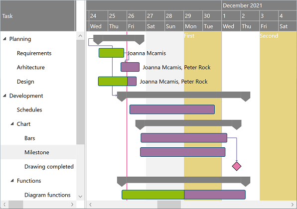
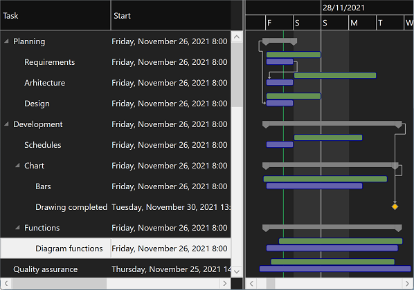
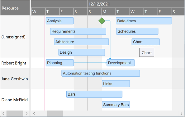
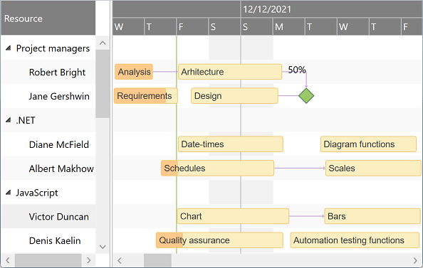
Powerful Gantt Chart controls
Customizable grid columns, summarized hierarchical data, beautiful and interactive chart with draggable bars and dependency lines, copy-paste, undo-redo, filtering and hierarchical sorting, detailed item change events.
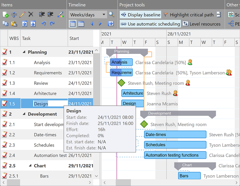
Built for project management
More than just charting: with optional auto-scheduling, PERT based critical path highlighting, resource leveling, baseline bars, and task splitting, you get a complete project management solution in a single app component.
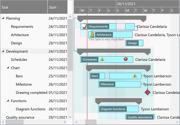
Multiple appearance settings, fully customizable templates
Change colors and other UI details either generally or for individual data items, or define templates for standard, milestone, and summary tasks, and for dependency lines. For example, to support interruptions as shown for some tasks below. Or download and adapt the default styles and templates for Gantt chart and PERT chart components as needed.
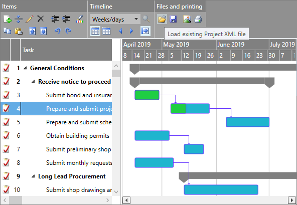
Printing, exporting images, Microsoft Project, and Excel®
Call Print method to initiate printing (or PDF exporting) of all grid and chart content at once. Export scalable diagram images that your end users can use for any purpose. Enable saving and loading Microsoft Project XML files using built-in methods of Gantt Chart components. Use Adapter API (free for product licensees) to save and load data from Excel® sheets, too.
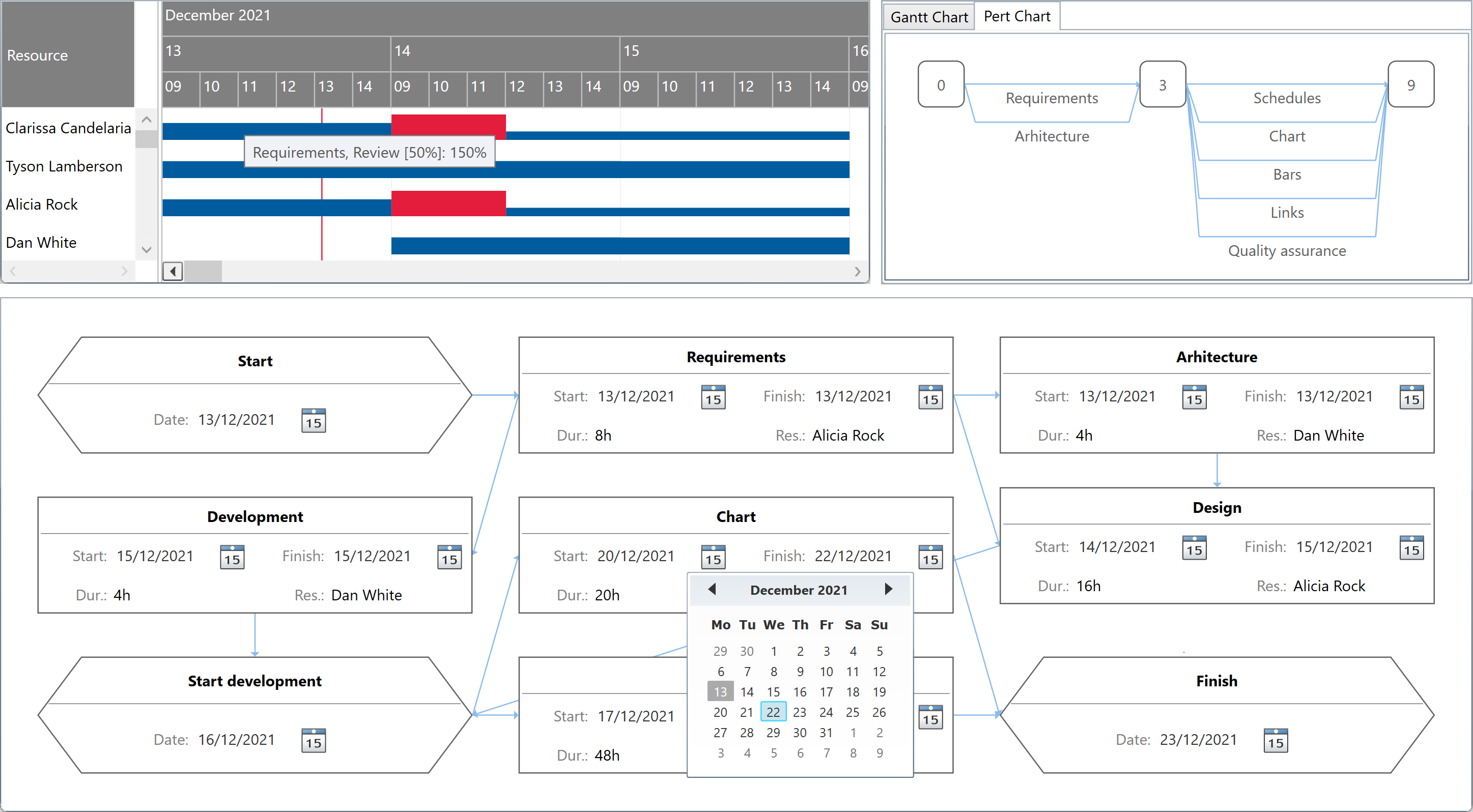
Timeline and calendars
Configurable timeline duration and zoom level, visible and working days and hours with fixed or periodic holidays or breaks (possibly different for each item if needed), scale headers with built-in or custom intervals and text formatters, and update interval applying upon dragging items.
Customizable date formats
Date and times are formatted using the current user's culture by default, but you can customize formatting too. For both standard date columns and custom item values that you supplementary need, e.g. to template and show secondary draggable data bound bars in the chart area too.
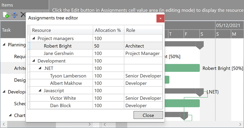
Grid cell editors
Use either built in or custom grid cell editors and converters. With DataTreeGrid component (available separately) you can easily obtain a hierarchical assignment selector dialog as the one presented below.
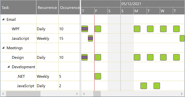
Multiple (recurrent) bars/row
Define custom columns and support properties to generate and display multiple chart items for each grid row. Daily, weekly, monthly, or yearly recurrence, with or without series end date: imagination is the only limit.
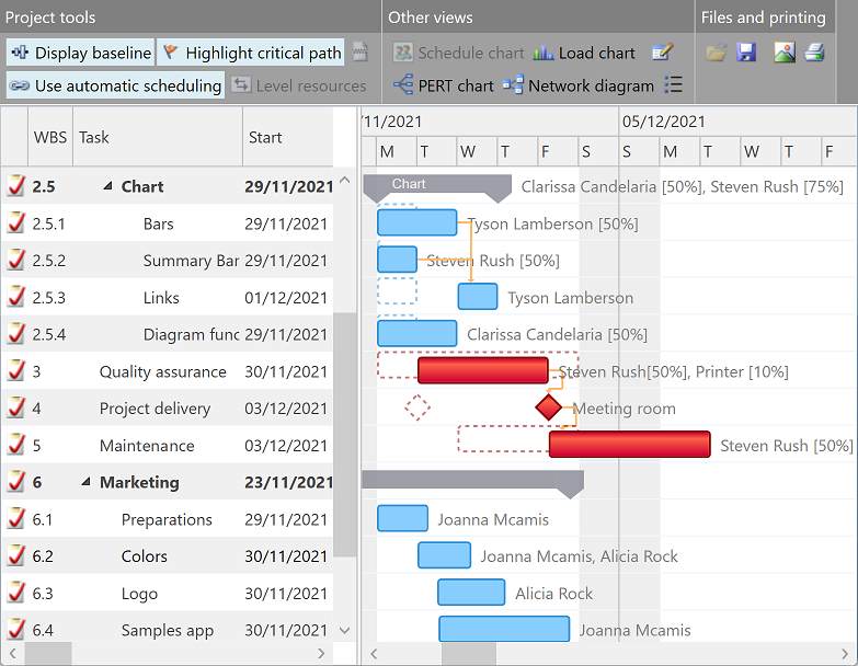
Schedule Charts
Present items assigned to any resource on a separate row, optionally on multiple lines in case of time conflicts. Allow dragging the bars vertically – from their bottom hoverable area – to set (or remove) their assignments.
Resource hierarchy
With ScheduleChartDataGrid, resources can be displayed in groups (of unlimited indentation levels) as well. Expanding an collapsing groups can help end users tremendously when comparing unrelated schedules.
Load Charts, PERT Charts, Network Diagrams
You can also easily generate other types of diagrams based on Gantt Chart items (or by defining data on the fly.)
Components
for WPF & .NET 4+ / .NET Core 3.1 / .NET 5+ and Silverlight™ 4+ with optional LightSwitch® extensions
Pricing
Multiple license types with different pricing options are available: there is one for everyone!
Mini Edition
Personal License
€{{ oldPrice1 }}
€{{ price1 }}
Order license
- Gantt Chart components only
- for a single developer
- royalty-free perpetuum license
- with unlimited support
Basic Edition
Small Team License
€{{ oldPrice2 }}
€{{ price2 }}
Order license
- Gantt Charts and Schedule Charts
- for a team of up to 3 developers
- royalty-free perpetuum license
- with unlimited support
Standard Edition
Business Plus License
€{{ oldPrice3 }}
€{{ price3 }}
Order license
- All components with source code
- for any development team size
- royalty-free perpetuum license
- with unlimited high priority support
-
{{ testimonial.details }}

{{ testimonial.author }}
{{ testimonial.organization }}