
ScheduleChartDataGrid
for WPF & .NET 4+ / .NET Core 3.1 / .NET 5+ and Silverlight™ 4+
New: WPF .NET Core/.NET 5+ support: with NuGet!
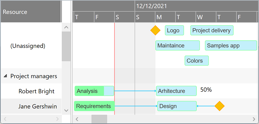
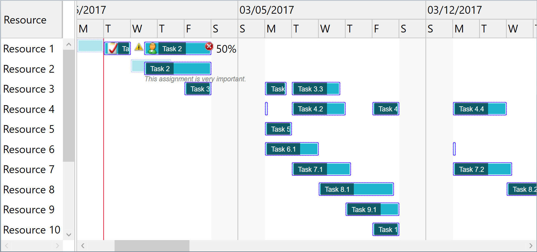
ScheduleChartDataGrid component displays and manages resource assignments using a data grid and an attached interactive Gantt Chart displaying multiple task bars on the same resource line and accepting horizontal and vertical drag and drop operations for scheduling task bars and changing assignments. Supports custom appearance settings for tasks for the entire chart or for individual items, as needed, inheriting core features and behavior from GanttChartDataGrid component.
-
WPF +
C#Demo<pdgcc:ScheduleChartDataGrid x:Name="ScheduleChartDataGrid"> <pdgcc:ScheduleChartDataGrid.Columns> <pdgcc:DataGridColumnCollection> <DataGridTextColumn Header="Resource" Binding="{Binding Content, Mode=TwoWay}" IsReadOnly="False" /> … </pdgcc:DataGridColumnCollection> </pdgcc:ScheduleChartDataGrid.Columns> … </pdgcc:ScheduleChartDataGrid>var items = new ObservableCollection<ScheduleChartItem> { new ScheduleChartItem { Content = "Resource 1", … }, new ScheduleChartItem { Content = "Resource 2", … }, … }; items[0].GanttChartItems.Add(new GanttChartItem { Content = "Task 1", Start = new DateTime(…), Finish = new DateTime(…), … }); items[0].GanttChartItems.Add(new GanttChartItem { Content = "Task 2", Start = new DateTime(…), Finish = new DateTime(…), … }); items[1].GanttChartItems.Add(new GanttChartItem { Content = "Task 3", Start = new DateTime(…), Finish = new DateTime(…), … }); … ScheduleChartDataGrid.Items = items; … -
WPF +
Visual Basic®<pdgcc:ScheduleChartDataGrid x:Name="ScheduleChartDataGrid"> <pdgcc:ScheduleChartDataGrid.Columns> <pdgcc:DataGridColumnCollection> <DataGridTextColumn Header="Resource" Binding="{Binding Content, Mode=TwoWay}" IsReadOnly="False" /> … </pdgcc:DataGridColumnCollection> </pdgcc:ScheduleChartDataGrid.Columns> … </pdgcc:ScheduleChartDataGrid>Dim items = New ObservableCollection(Of ScheduleChartItem) From { _ New ScheduleChartItem With { .Content = "Resource 1", … }, _ New ScheduleChartItem With { .Content = "Resource 2", … }, _ … _ } items(0).GanttChartItems.Add(New GanttChartItem With { .Content = "Task 1", .Start = new Date(…), .Finish = new Date(…), … }); items(0).GanttChartItems.Add(New GanttChartItem With { .Content = "Task 2", .Start = new Date(…), .Finish = new Date(…), … }); items(1).GanttChartItems.Add(New GanttChartItem With { .Content = "Task 3", .Start = new Date(…), .Finish = new Date(…), … }); … ScheduleChartDataGrid.Items = items … -
Silverlight™ +
C#Demo<pdgcc:ScheduleChartDataGrid x:Name="ScheduleChartDataGrid"> <pdgcc:ScheduleChartDataGrid.Columns> <pdgcc:DataGridColumnCollection> <d:DataGridTextColumn Header="Resource" Binding="{Binding Content, Mode=TwoWay}" IsReadOnly="False" /> … </pdgcc:DataGridColumnCollection> </pdgcc:ScheduleChartDataGrid.Columns> … </pdgcc:ScheduleChartDataGrid>var items = new ObservableCollection<ScheduleChartItem> { new ScheduleChartItem { Content = "Resource 1", … }, new ScheduleChartItem { Content = "Resource 2", … }, … }; items[0].GanttChartItems.Add(new GanttChartItem { Content = "Task 1", Start = new DateTime(…), Finish = new DateTime(…), … }); items[0].GanttChartItems.Add(new GanttChartItem { Content = "Task 2", Start = new DateTime(…), Finish = new DateTime(…), … }); items[1].GanttChartItems.Add(new GanttChartItem { Content = "Task 3", Start = new DateTime(…), Finish = new DateTime(…), … }); … ScheduleChartDataGrid.Items = items; … -
Silverlight™ +
Visual Basic®<pdgcc:ScheduleChartDataGrid x:Name="ScheduleChartDataGrid"> <pdgcc:ScheduleChartDataGrid.Columns> <pdgcc:DataGridColumnCollection> <d:DataGridTextColumn Header="Resource" Binding="{Binding Content, Mode=TwoWay}" IsReadOnly="False" /> … </pdgcc:DataGridColumnCollection> </pdgcc:ScheduleChartDataGrid.Columns> … </pdgcc:ScheduleChartDataGrid>Dim items = New ObservableCollection(Of ScheduleChartItem) From { _ New ScheduleChartItem With { .Content = "Resource 1", … }, _ New ScheduleChartItem With { .Content = "Resource 2", … }, _ … _ } items(0).GanttChartItems.Add(New GanttChartItem With { .Content = "Task 1", .Start = new Date(…), .Finish = new Date(…), … }); items(0).GanttChartItems.Add(New GanttChartItem With { .Content = "Task 2", .Start = new Date(…), .Finish = new Date(…), … }); items(1).GanttChartItems.Add(New GanttChartItem With { .Content = "Task 3", .Start = new Date(…), .Finish = new Date(…), … }); … ScheduleChartDataGrid.Items = items …
Items collection
To load and present data with ScheduleChartDataGrid control, initialize the Items collection of the component, setting up ScheduleChartItem objects representing resource rows identified by these main properties: Content, and GanttChartItems. GanttChartItems collection (objects of type GanttChartItem) defines timeline assignments and are identified by these properties: Content, Start, Finish, CompletedFinish, IsMilestone, and AssignmentsContent.
Standard items are presented as rectangular bars, and milestones as special diamond shapes in the view. Completion rate of a standard assignment item is determined by evaluating CompletedFinish value, representing the date and time up to which the effort is currently considered completed. By convention, AssignmentsContent value may be a string that specifies the allocation units in this format: 50%.
You may set an ID or GUID for any item object as Key and GlobalKey property values, useful when mapping to relational data storage access layers. A generic Tag property is also available to support miscellaneous object linking scenarios. Note that you can also prepare items for ScheduleChartDataGrid component from a GanttChartDataGrid instance using GetScheduleChartItems method, and then synchronize changes back to the source later.
var items = new ObservableCollection<ScheduleChartItem>
{
    new ScheduleChartItem { Content = "Resource 1" },
    new ScheduleChartItem { Content = "Resource 2" }
};
items[0].GanttChartItems.Add(new GanttChartItem { Content = "Task A (Resource 1)",
                                                  Start = new DateTime(year, month, 2, 8, 0, 0), Finish = new DateTime(year, month, 8, 16, 0, 0),
                                                  CompletedFinish = new DateTime(year, month, 5, 16, 0, 0) });
items[1].GanttChartItems.Add(new GanttChartItem { Content = "Task A (Resource 2)",
                                                  Start = new DateTime(year, month, 2, 8, 0, 0), Finish = new DateTime(year, month, 8, 16, 0, 0),
                                                  CompletedFinish = new DateTime(year, month, 5, 16, 0, 0), AssignmentsContent = "50%" });
items[1].GanttChartItems.Add(new GanttChartItem { Content = "Task B (Resource 2)",
                                                  Start = new DateTime(year, month, 11, 8, 0, 0), Finish = new DateTime(year, month, 12, 16, 0, 0),
                                                  CompletedFinish = new DateTime(year, month, 12, 16, 0, 0) });
items[1].GanttChartItems.Add(new GanttChartItem { Content = "Task C (Resource 2)",
                                                  Start = new DateTime(year, month, 14, 8, 0, 0), Finish = new DateTime(year, month, 14, 16, 0, 0) });
ScheduleChartDataGrid.Items = items;
var items = GanttChartDataGrid.GetScheduleChartItems();
ScheduleChartDataGrid.Items = items;
…
GanttChartDataGrid.UpdateChangesFromScheduleChartItems(items);
Drag and drop
End users may use horizontal drag and drop operations to reschedule bars, update start, finish and completion values independently.
They can also perform vertical drag and drop operations to update assignments, by hovering the bottom line of the task bars.
Edit and Undo operations
Copy and Paste operations are available as built-in features of the component. Data is copied to the Clipboard as tab separated values so they may be easily pasted into Microsoft Excel® sheets or other applications with tabular data import support. Move, MoveUp, and MoveDown operations allow moving selected items in the collection.
A built-in undo queue is available, with Undo and Redo operations that may be easily called from code.
Performance
We have designed the component to achieve maximum runtime performance, loading and displaying thousands of items while remaining highly responsive. The control has IsAsyncPresentationEnabled and IsVirtualizing properties set to true by default, so asynchronous data loading and user interface virtualization are turned on unless you set them off manually.
Timeline and calendars
You may configure timeline duration, visible and working days and hours, scales, update interval (for drag and drop operations), and zoom level (width of an hour) in the view. The component can further be zoomed in and out by moving the mouse wheel. Nonworking intervals, such as holidays or simple day breaks, may be defined either as a collection or using a delegate.
When the end user horizontally scrolls to an end of the timeline viewport special buttons appear to allow updating the timeline page, increasing both start and finish ends synchronously. The component also supports automatic zooming, depending on the set up timeline page. Otherwise, the timeline is automatically scrolled horizontally to the start time of a selected task when that date and time is within the set up timeline page.
You can configure working and nonworking time for individual items, when needed, using Schedule objects. Actually, a general calendar may also be provided this way, by setting the Schedule property of the component itself. An individual item may have more or less working time than configured at view level, and therefore they will behave differently when setting start and finish values, including when using drag and drop update operations.
-
WPF
<pdgcc:ScheduleChartDataGrid x:Name="ScheduleChartDataGrid" HourWidth="20" HeaderHeight="60" ScaleHeaderHeight="20" >
    <!-- Set Scales collection to specify the headers to be displayed in the chart. -->
    <pdgcc:ScheduleChartDataGrid.Scales>
        <pdgcc:ScaleCollection>
            <pdgcc:Scale ScaleType="Months" HeaderBorderBrush="Silver" HeaderBorderThickness="0,0,1,1"
                         HeaderContentTemplate="{StaticResource ScaleHeaderContentTemplate}" BorderBrush="Silver" BorderThickness="0,0,1,0"/>
            <pdgcc:Scale ScaleType="Weeks" HeaderHeight="0" BorderBrush="Silver" BorderThickness="0,0,0.35,0"/>
            <pdgcc:Scale ScaleType="Days" HeaderContentFormat="DayLeadingZero" … />
            <pdgcc:Scale ScaleType="Hours" HeaderContentTemplate="{StaticResource ScaleHeaderContentTemplate}" … />
        </pdgcc:ScaleCollection>
    </pdgcc:ScheduleChartDataGrid.Scales>
    …
</pdgcc:ScheduleChartDataGrid>
ScheduleChartDataGrid.SetTimelinePage(start, finish); // Optionally, enable automatic zoom level based on timeline page: ScheduleChartDataGrid.IsFittingToTimelinePageEnabled = true;ScheduleChartDataGrid.VisibleWeekStart = DayOfWeek.Monday; ScheduleChartDataGrid.VisibleWeekFinish = DayOfWeek.Friday; // Mon-Fri ScheduleChartDataGrid.WorkingWeekStart = DayOfWeek.Monday; ScheduleChartDataGrid.WorkingWeekFinish = DayOfWeek.Thursday; // Mon-Thu ScheduleChartDataGrid.WorkingDayStart = TimeSpan.FromHours(10); ScheduleChartDataGrid.WorkingDayFinish = TimeSpan.FromHours(19); // 10-19 ScheduleChartDataGrid.NonworkingIntervals = …;
Custom schedule demoScheduleChartDataGrid.Schedule = new Schedule(…); item.Schedule = new Schedule(…); -
Silverlight™
<pdgcc:ScheduleChartDataGrid x:Name="ScheduleChartDataGrid" HourWidth="20" HeaderHeight="60" ScaleHeaderHeight="20" >
    <!-- Set Scales collection to specify the headers to be displayed in the chart. -->
    <pdgcc:ScheduleChartDataGrid.Scales>
        <pdgcc:ScaleCollection>
            <pdgcc:Scale ScaleType="Months" HeaderBorderBrush="Silver" HeaderBorderThickness="0,0,1,1"
                         HeaderContentTemplate="{StaticResource ScaleHeaderContentTemplate}" BorderBrush="Silver" BorderThickness="0,0,1,0"/>
            <pdgcc:Scale ScaleType="Weeks" HeaderHeight="0" BorderBrush="Silver" BorderThickness="0,0,0.35,0"/>
            <pdgcc:Scale ScaleType="Days" HeaderContentFormat="DayLeadingZero" … />
            <pdgcc:Scale ScaleType="Hours" HeaderContentTemplate="{StaticResource ScaleHeaderContentTemplate}" … />
        </pdgcc:ScaleCollection>
    </pdgcc:ScheduleChartDataGrid.Scales>
    …
</pdgcc:ScheduleChartDataGrid>
ScheduleChartDataGrid.SetTimelinePage(start, finish); // Optionally, enable automatic zoom level based on timeline page: ScheduleChartDataGrid.IsFittingToTimelinePageEnabled = true;ScheduleChartDataGrid.VisibleWeekStart = DayOfWeek.Monday; ScheduleChartDataGrid.VisibleWeekFinish = DayOfWeek.Friday; // Mon-Fri ScheduleChartDataGrid.WorkingWeekStart = DayOfWeek.Monday; ScheduleChartDataGrid.WorkingWeekFinish = DayOfWeek.Thursday; // Mon-Thu ScheduleChartDataGrid.WorkingDayStart = TimeSpan.FromHours(10); ScheduleChartDataGrid.WorkingDayFinish = TimeSpan.FromHours(19); // 10-19 ScheduleChartDataGrid.NonworkingIntervals = …;
Custom schedule demoScheduleChartDataGrid.Schedule = new Schedule(…); item.Schedule = new Schedule(…);
Data binding
Although we designed the component to support items of specific types only (ScheduleChartItem and GanttChartItem) to ensure high runtime performance, you may use our built-in collection converter (ResourceItemsConverter) to set up data binding to custom collection types with ease. Alternatively, you can use a fully custom converter to provide collection synchronization upon your own needs.
The component is persistence layer independent, so you can bind it to data collections from virtually any data source, including but not limited to SQL Server® databases.
-
WPFBinding demo Custom converter demo
<pdgcc:ScheduleChartDataGrid>
    <pdgcc:ScheduleChartDataGrid.Items>
        <Binding>
            <Binding.Converter>
                <!-- Set *Member properties to identify custom item properties that need to be internally bound. -->
                <!-- Optionally, set UpdateTargetOnSourceChanges and/or UpdateSourceOnTargetChanges to true/false as needed. -->
                <pdgcc:ResourceItemsConverter ContentMember="Name" AssignedTasksMember="AssignedTasks"
                                              TaskContentMember="Name" TaskStartMember="StartDate" TaskFinishMember="FinishDate"
                                              TaskCompletedFinishMember="CompletionCurrentDate" TaskAssignmentsContentMember="AssignmentsString" />
            </Binding.Converter>
        </Binding>
    </pdgcc:ScheduleChartDataGrid.Items>
    <pdgcc:ScheduleChartDataGrid.Columns>
        <!-- Define new columns for custom properties, using Tag prefix to refer the original custom data item properties. -->
        <DataGridTextColumn Header="Description" Binding="{Binding Tag.Description, Mode=TwoWay}" IsReadOnly="False" />
    </pdgcc:ScheduleChartDataGrid.Columns>
</pdgcc:ScheduleChartDataGrid>
var items = new ObservableCollection<CustomResourceItem> { new CustomResourceItem { Name = "Resource 1", Description = "Description of custom resource 1", AssignedTasks = new ObservableCollection<CustomTaskItem> { new CustomTaskItem { Name = "Task 1", StartDate = DateTime.Today.Add(TimeSpan.Parse("08:00:00")), FinishDate = DateTime.Today.Add(TimeSpan.Parse("16:00:00")), CompletionCurrentDate = DateTime.Today.Add(TimeSpan.Parse("12:00:00")) }, new CustomTaskItem { Name = "Task 2", StartDate = DateTime.Today.AddDays(1).Add(TimeSpan.Parse("12:00:00")), FinishDate = DateTime.Today.AddDays(2).Add(TimeSpan.Parse("16:00:00")), AssignmentsString = "50%" } } }, new CustomResourceItem { Name = "Resource 2", Description = "Description of custom resource 2", AssignedTasks = new ObservableCollection<CustomTaskItem> { new CustomTaskItem { Name = "Task 2", StartDate = DateTime.Today.AddDays(1).Add(TimeSpan.Parse("12:00:00")), FinishDate = DateTime.Today.AddDays(2).Add(TimeSpan.Parse("16:00:00")) } } } }; DataContext = items; -
Silverlight™Binding demo Custom converter demo
<pdgcc:ScheduleChartDataGrid>
    <pdgcc:ScheduleChartDataGrid.Items>
        <Binding>
            <Binding.Converter>
                <!-- Set *Member properties to identify custom item properties that need to be internally bound. -->
                <!-- Optionally, set UpdateTargetOnSourceChanges and/or UpdateSourceOnTargetChanges to true/false as needed. -->
                <pdgcc:ResourceItemsConverter ContentMember="Name" AssignedTasksMember="AssignedTasks"
                                              TaskContentMember="Name" TaskStartMember="StartDate" TaskFinishMember="FinishDate"
                                              TaskCompletedFinishMember="CompletionCurrentDate" TaskAssignmentsContentMember="AssignmentsString" />
            </Binding.Converter>
        </Binding>
    </pdgcc:ScheduleChartDataGrid.Items>
    <pdgcc:ScheduleChartDataGrid.Columns>
        <!-- Define new columns for custom properties, using Tag prefix to refer the original custom data item properties. -->
        <d:DataGridTextColumn Header="Description" Binding="{Binding Tag.Description, Mode=TwoWay}" IsReadOnly="False" />
    </pdgcc:ScheduleChartDataGrid.Columns>
</pdgcc:ScheduleChartDataGrid>
var items = new ObservableCollection<CustomResourceItem> { new CustomResourceItem { Name = "Resource 1", Description = "Description of custom resource 1", AssignedTasks = new ObservableCollection<CustomTaskItem> { new CustomTaskItem { Name = "Task 1", StartDate = DateTime.Today.Add(TimeSpan.Parse("08:00:00")), FinishDate = DateTime.Today.Add(TimeSpan.Parse("16:00:00")), CompletionCurrentDate = DateTime.Today.Add(TimeSpan.Parse("12:00:00")) }, new CustomTaskItem { Name = "Task 2", StartDate = DateTime.Today.AddDays(1).Add(TimeSpan.Parse("12:00:00")), FinishDate = DateTime.Today.AddDays(2).Add(TimeSpan.Parse("16:00:00")), AssignmentsString = "50%" } } }, new CustomResourceItem { Name = "Resource 2", Description = "Description of custom resource 2", AssignedTasks = new ObservableCollection<CustomTaskItem> { new CustomTaskItem { Name = "Task 2", StartDate = DateTime.Today.AddDays(1).Add(TimeSpan.Parse("12:00:00")), FinishDate = DateTime.Today.AddDays(2).Add(TimeSpan.Parse("16:00:00")) } } } }; DataContext = items;
Grid columns, row filtering, sorting, and changes
You may customize the column collection of the grid by adding or redesigning data bound and cell template based columns. You may sort and filter items out using Sort method of the component and by setting item.IsHidden values to true.
To be notified when items managed by the component change, simply handle the ItemCollectionChanged and ItemPropertyChanged events.
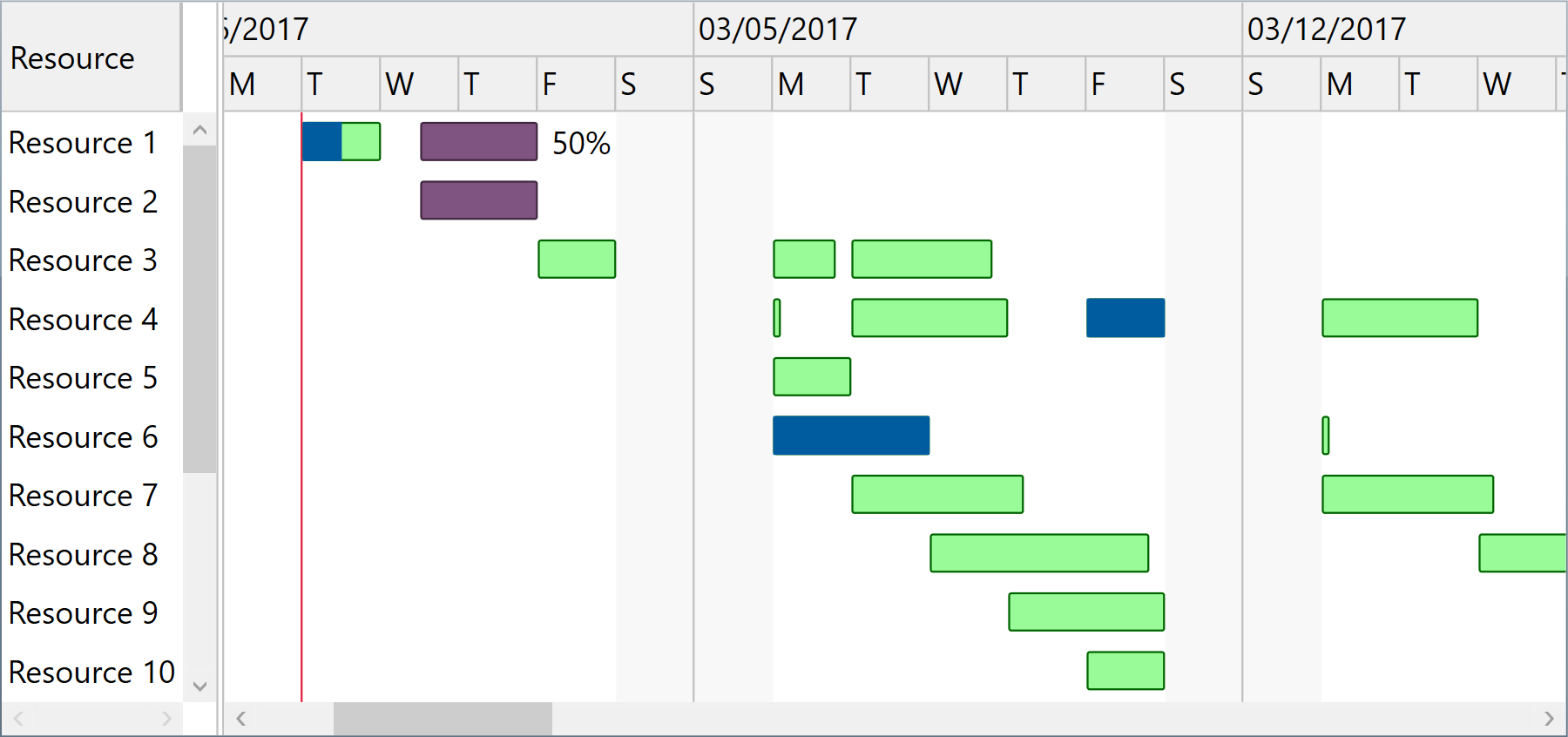
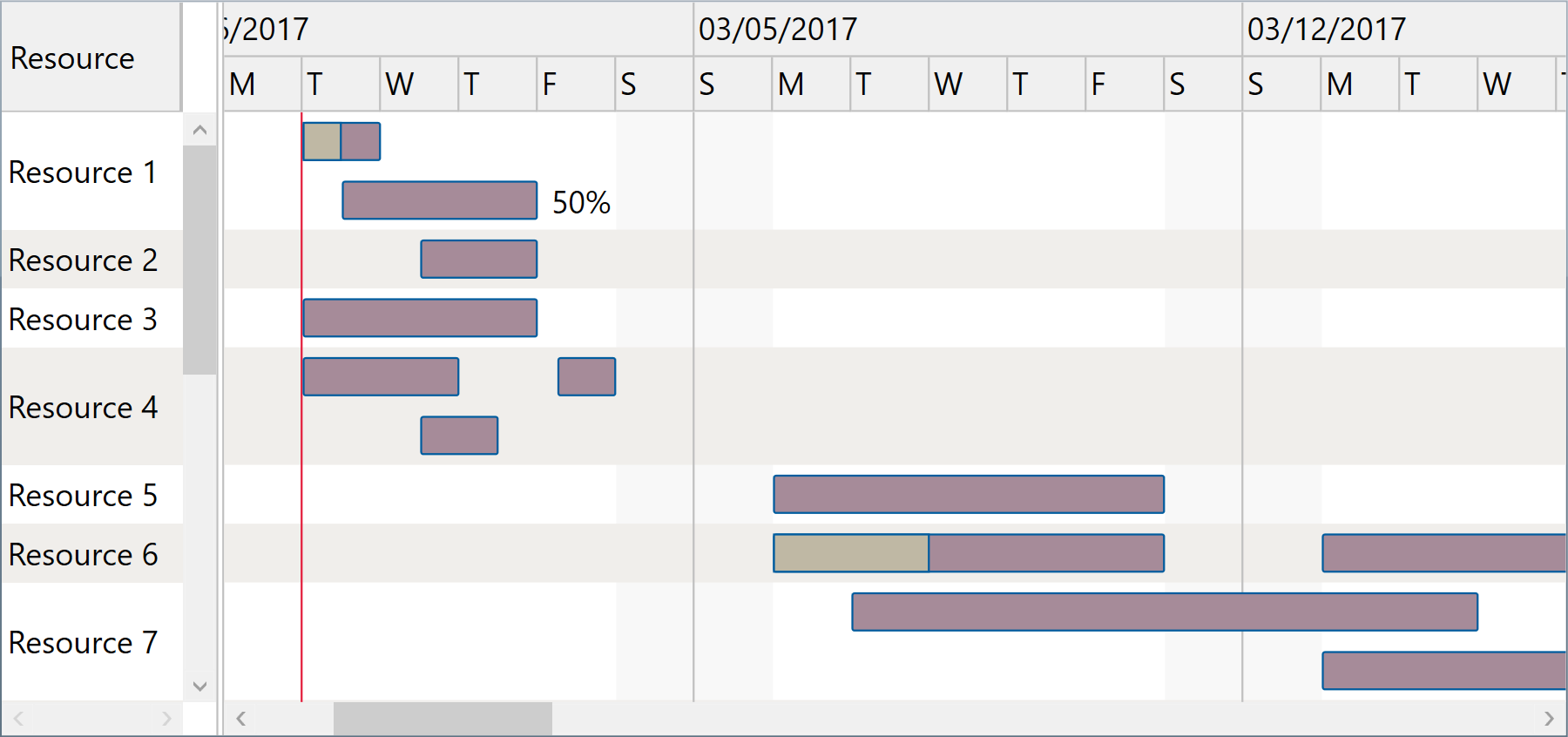
Appearance and bar templates
You may fully customize item appearance, either for the entire chart or for individual entries in the view, using attached properties such as GanttChartView.StandardBarFill, StandardBarStroke, MilestoneBarFill, etc.
When you need to develop advanced features in your timeline based application, chart bars may be fully redesigned using XAML based templates for StandardTaskTemplate and MilestoneTaskTemplate properties of the component.
And if you need to customize component input interactions, you may handle mouse events and get information about the visually hit elements with ease.
-
WPF
<pdgcc:ScheduleChartDataGrid StandardBarFill="Orange" StandardBarStroke="Red">
    …
</pdgcc:ScheduleChartDataGrid>
Custom appearance demo Bar templates demo Pointer handling demoGanttChartView.SetStandardBarFill(ganttChartItem, Brushes.Yellow); GanttChartView.SetStandardBarStroke(ganttChartItem, Brushes.Orange); -
Silverlight™
<pdgcc:ScheduleChartDataGrid StandardBarFill="Orange" StandardBarStroke="Red">
    …
</pdgcc:ScheduleChartDataGrid>
Custom appearance demo Bar templates demo Pointer handling demoGanttChartView.SetStandardBarFill(ganttChartItem, Brushes.Yellow); GanttChartView.SetStandardBarStroke(ganttChartItem, Brushes.Orange);
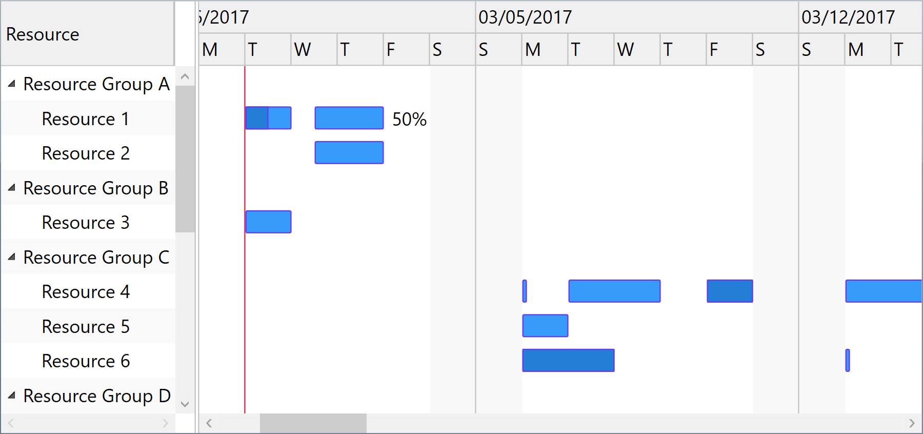
Hierarchical grouping and displaying multiple lines per row
Resource rows may also be grouped hierarchically, if needed, using Indentation property of ScheduleChartItem. Summary items are determined by checking Indentation levels of subsequent items, and become resource groups that can be expanded or collapsed.
And separately, when multiple assignments of the same resource overlap, their bars may be covering each other. However, you can easily address this by setting UseMultipleLinesPerRow property of the component to true.
-
WPF
-
Silverlight™
Printing and image exporting
The component offers a Print method that may be called to initiate a direct print operation for its content. A custom PrintingTemplate definition that you can specify using XAML is repeatedly used when generating the printed pages.
Moreover, you can export scalable images of the component content by calling GetBitmapSource method on the fly. For example, you may then encode an output image to an external file format such as PNG, include the image into an element displayed in a custom printed document, or simply displaying it as read only content on the screen.
ScheduleChartDataGrid.Print("Sample Document");
ScheduleChartDataGrid.Export((Action)delegate
{
    SaveFileDialog saveFileDialog =
        new SaveFileDialog { Title = "Export Image To", Filter = "PNG image files|*.png" };
    if (saveFileDialog.ShowDialog() != true)
        return;
    BitmapSource bitmapSource = ScheduleChartDataGrid.GetExportBitmapSource(96 * 2);
    using (Stream stream = saveFileDialog.OpenFile())
    {
        PngBitmapEncoder pngBitmapEncoder = new PngBitmapEncoder();
        pngBitmapEncoder.Frames.Add(BitmapFrame.Create(bitmapSource));
        pngBitmapEncoder.Save(stream);
    }
});
Windows® Forms
You may use the WPF component in Windows® Forms applications using Microsoft® ElementHost control from WindowsFormsIntegration assembly of .NET 4+.
Optionally, you can define a XAML user control in your Windows® Forms project to serve for encapsulation.
var items = …;
var host = new ElementHost
{
    Child = new ScheduleChartDataGrid
    {
        Items = items,
        …
    },
    Dock = DockStyle.Fill
};
Controls.Add(host);
Windows® Forms demo