GanttChartView
for HTML5 and JavaScript® with optional TypeScript support and Angular & React extensions
Angular 8, React & Vue components: within downloadable package (.zip)
GanttChartView component displays and manages tasks and dependencies using a hierarchical data grid and an attached interactive Gantt Chart accepting drag and drop operations for scheduling task bars and creating dependency lines. Supports custom appearance settings for standard, summary, and milestone tasks for the entire chart or for individual items, as needed.
Responsive in <3 sec. when loading 10,000 items on modern computers.
-
JavaScript®
Demovar ganttChartView = document.getElementById("ganttChartView"); var items = [{ content: "Task 1", start: new Date(…), finish: new Date(…), … }, { content: "Task 2", start: new Date(…), finish: new Date(…), … }, …]; items[1].predecessors = [{ item: items[0], … }, …]; … var settings = { … }; DlhSoft.Controls.GanttChartView.initialize(ganttChartView, items, settings); … ganttChartView.refresh(); -
TypeScript
Demo/// <reference path='./DlhSoft.ProjectData.GanttChart.HTML.Controls.d.ts' /> import GanttChartView = DlhSoft.Controls.GanttChartView; import TaskItem = GanttChartView.Item; var ganttChartViewElement = document.getElementById("ganttChartView"); var items = <TaskItem[]>[ { content: "Task 1", start: new Date(…), finish: new Date(…), … }, { content: "Task 2", start: new Date(…), finish: new Date(…), … }, …]; items[1].predecessors = [{ item: items[0], … , …]; … var settings = <GanttChartView.Settings>{ … }; var ganttChartView = GanttChartView.initialize(ganttChartViewElement, items, settings); … ganttChartView.refresh(); -
AngularJSDemo
<!-- AngularJS module dependency: DlhSoft.ProjectData.GanttChart.Directives -->
<ds:gantt-chart items="items" settings="settings" auto-refresh="{{ true }}">
    …
</ds:gantt-chart>
var items = [{ content: "Task 1", start: new Date(…), finish: new Date(…), … }, { content: "Task 2", start: new Date(…), finish: new Date(…), … }, …]; items[1].predecessors = [{ item: items[0], … }, …]; … $scope.items = items; $scope.settings = { … }; -
Angular 8Demo
<!-- Dependencies: DlhSoft.ProjectData.GanttChart.HTML.Controls, DlhSoft.ProjectData.GanttChart.Angular.Components -->
<ganttchartview [items]="items" [settings]="settings">
    …
</ganttchartview>
import TaskItem = GanttChartView.Item; var items = <TaskItem[]>[ { content: "Task 1", start: new Date(…), finish: new Date(…), … }, { content: "Task 2", start: new Date(…), finish: new Date(…), … }, …]; items[1].predecessors = [{ item: items[0], … }, …]; … this.items = items; this.settings = { … }; -
ReactDemo
// Dependencies: DlhSoft.ProjectData.GanttChart.HTML.Controls, DlhSoft.ProjectData.GanttChart.React.Components var items = [{ content: "Task 1", start: new Date(…), finish: new Date(…), … }, { content: "Task 2", start: new Date(…), finish: new Date(…), … }, …]; items[1].predecessors = [{ item: items[0], … }, …]; … return <GanttChartView items={items} settings={…}>…</GanttChartView>; -
VueDemo
<!-- Dependencies: DlhSoft.ProjectData.GanttChart.HTML.Controls, DlhSoft.ProjectData.GanttChart.Vue.Components -->
<gantt-chart v-bind:items="items" v-bind:settings="settings">
    …
</gantt-chart>
var items = [{ content: "Task 1", start: new Date(…), finish: new Date(…), … }, { content: "Task 2", start: new Date(…), finish: new Date(…), … }, …]; items[1].predecessors = [{ item: items[0], … }, …]; … var app = new Vue({ el: …, data: { items: items, settings: {…} } });
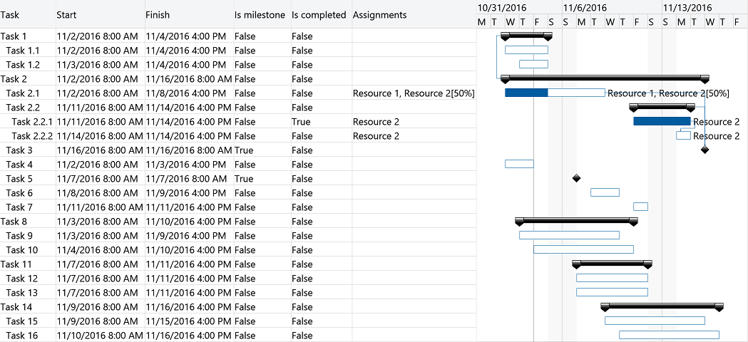
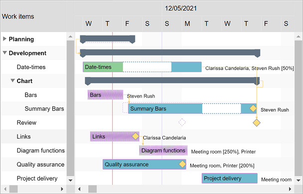
Items collection
To load and present data with GanttChartView control, initialize the items collection of the component, setting up objects representing timeline tasks identified by these main fields: indentation, content, start, finish, completedFinish, isMilestone, assignmentsContent, and predecessors.
Summary items are determined by checking indentation levels of subsequent items, and can be expanded or collapsed. Standard items are presented as rectangular bars, and milestones as special diamond shapes in the view. Date values of start and finish may be initialized using Date objects, but JSON-formatted string values are also supported. Completion rate of a standard item is determined by evaluating completedFinish value, representing the date and time up to which the effort is currently considered completed. By convention, assignmentsContent value may be a string that specifies the resource assignments of the item with optional allocation units in classic format: Resource 1, Resource 2 [50%].
Predecessors collection defines item dependencies and are identified by these fields: item, dependencyType, and lag. DependencyType may be finish-to-start ("FS"), start-to-start ("SS"), finish-to-finish ("FF"), or start-to-finish ("SF"). An optional lag time span (specified in milliseconds) is also supported for item dependencies.
var items = [{ content: "Task 1", isExpanded: false },
             { content: "Task 1.1", indentation: 1, start: new Date(year, month, 2, 8, 0, 0), finish: new Date(year, month, 4, 16, 0, 0) },
             { content: "Task 1.2", indentation: 1, start: new Date(year, month, 3, 8, 0, 0), finish: new Date(year, month, 5, 12, 0, 0) },
             { content: "Task 2", isExpanded: true },
             { content: "Task 2.1", indentation: 1, start: new Date(year, month, 2, 8, 0, 0), finish: new Date(year, month, 8, 16, 0, 0),
               completedFinish: new Date(year, month, 5, 16, 0, 0), assignmentsContent: "Resource 1, Resource 2 [50%]" },
             { content: "Task 2.2", indentation: 1 },
             { content: "Task 2.2.1", indentation: 2, start: new Date(year, month, 11, 8, 0, 0), finish: new Date(year, month, 12, 16, 0, 0),
               completedFinish: new Date(year, month, 12, 16, 0, 0), assignmentsContent: "Resource 2" },
             { content: "Task 2.2.2", indentation: 2, start: new Date(year, month, 12, 12, 0, 0), finish: new Date(year, month, 14, 16, 0, 0),
               assignmentsContent: "Resource 2" },
             { content: "Task 3", indentation: 1, start: new Date(year, month, 15, 16, 0, 0), isMilestone: true }];
items[3].predecessors = [{ item: items[0], dependencyType: "SS" }];
items[7].predecessors = [{ item: items[6], lag: 2 * 60 * 60 * 1000 }];
items[8].predecessors = [{ item: items[4] }, { item: items[5] }];
DlhSoft.Controls.GanttChartView.initialize(ganttChartView, items, settings);
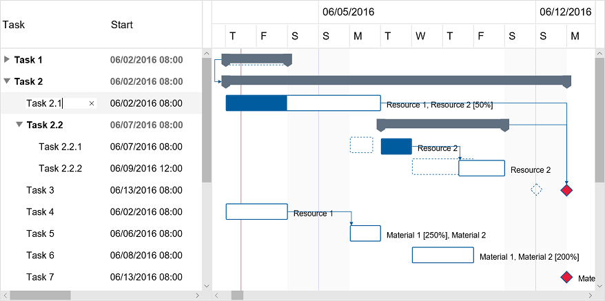
Drag and drop
End users may use drag and drop operations to reschedule bars, update start, finish and completion values independently, and create all types of dependencies between items directly from the Gantt Chart area, besides editing values in the attached data grid.
Move operations
MoveItem, moveItemUp, moveItemDown, and moveItemHierarchy operations allow moving specific items in the hierarchy, with or without child items. You may even add a special icon column to allow visual drag and drop operations for moving items around.
Performance
We have designed the component to achieve maximum runtime performance, loading and displaying thousands of items while remaining highly responsive. Item loading is always asynchronous as the control has the virtualization feature (isVirtualizing field) turned on by default.
Timeline and calendars
You may configure timeline duration, visible and working days and hours, scales, update interval (for drag and drop operations), and zoom level (width of an hour) in the view. The component can further be zoomed in and out by moving the mouse wheel. Special nonworking days may be defined as a simple array of Date objects.
You can also configure working and nonworking time for individual items, when needed, using Schedule objects. Actually, a general calendar may also be provided this way, by setting the schedule field of the component settings. An individual item may have more or less working time than configured at view level, and therefore they will behave differently when setting start and finish values, including when using drag and drop update operations.
settings.timelineStart = start; settings.timelineFinish = finish;
settings.visibleWeekStart = 1; settings.visibleWeekFinish = 5; // Mon-Fri
settings.workingWeekStart = 1; settings.workingWeekFinish = 4; // Mon-Thu
settings.workingDayStart = 10 * hourDuration; settings.workingDayFinish = 19 * hourDuration; // 10-19
settings.scales = [ { scaleType: "Months"; headerTextFormat: "Month", … } ];
settings.updateScale = 15 * minuteDuration;
settings.hourWidth = 5;
settings.specialNonworkingDays = [ new Date(…), … ];
settings.schedule = { workingWeekStart: 1, workingWeekFinish: 5, … }; // Mon-Fri
item.schedule = { workingWeekStart: 2, workingWeekFinish: 6, … }; // Tue-Sat
Scale demo
Schedules demo
Project management features and Microsoft® Project compatibility
Besides data visualization features, the component offers built-in computation functions such as getItemDuration, getItemEffort, getItemCompletedEffort, getItemCompletion, getItemCost, etc., project management algorithms such as baseline initialization and visualization, auto scheduling, critical path enumeration, work optimization, and allocation and resource leveling, optionally based on pre-initialized generic or individual resource usage costs and material resource quantities. Circular dependencies are accepted by default, but are detected and removed automatically if you enable dependency constraints.
Gantt Chart component supports loading and saving data in Microsoft Project® XML format by using loadXml and getXml methods a ProjectSerializer instance, allowing you to import and export Microsoft Project® compatible content with ease. Moreover, ProjectSerializer settings offers support for further customizing the way actual loading and saving operations occur, allowing you to inject custom code for XML parsing and generation with handler methods on specific events.
var effort = ganttChartView.getItemTotalEffort(item);
var percentCompleted = ganttChartView.getItemCompletion(item) * 100;
ganttChartView.setupBaseline(); settings.isBaselineVisible = true;
settings.areTaskDependencyConstraintsEnabled = true;
var criticalItems = ganttChartView.getCriticalItems();
settings.specificResourceHourCosts = …; settings.resourceQuantities = …;
ganttChartView.optimizeWork(); ganttChartView.levelAllocations(); ganttChartView.levelResources();
var serializer = DlhSoft.Controls.GanttChartView.ProjectSerializer.initialize(ganttChartView, settings);
var projectXml = serializer.getXml();
serializer.loadXml(projectXml);
Microsoft® Excel adapter
If your solution has a server side tier based on Microsoft® .NET, you can also use DlhSoft's ProjectManagementXlsx Adapter API (open source) to generate Excel® files from Project XML formatted content and share task information with more ease. And, of course, you import tasks from an Excel® sheet through Microsoft® Project XML format back into a Gantt Chart component, too.
Excel® serialization support is available as well through a separate NuGet package.
The adapter requires a license for Project Management Framework. Hyper Library licensees can order a free license for the secondary product.
var excelBytes = File.ReadAllBytes(source);
var projectXml = ProjectManagementXslx.Adapter.GetProjectXml(excelBytes);
var projectXml = Encoding.UTF8.GetString(File.ReadAllBytes(source));
var excelBytes = ProjectManagementXslx.Adapter.GetExcelBytes(projectXml);
Converter demo
Persistence and platform independence
The component is persistence layer and transport independent, so you can load and save data items from and to any data source, including but not limited to SQL Server® databases, and transport it between the server and client in any custom way. For example, you may use ASP .NET MVC and WebAPI, node.js, or PHP on the server side to generate clean user interface and communicate data to and from the client side using REST services, and initialize and run the component on client side with pure JavaScript® code.
DlhSoft JavaScript® code doesn't rely on external dependencies and therefore the component works virtually on any platform – desktop or mobile – and in any type of HTML application – client side, server side, or standalone.
SQL Server® + WebAPI node.js PHP LightSwitch® Windows® Store app (UWP) Cordova™Grid columns, rows, and changes
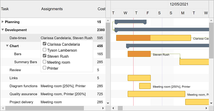
You may customize the column collection of the grid by resetting it or by adding and removing built-in columns and optionally defining new ones using JavaScript® functions initialized as column.cellTemplate. You may also filter items out hierarchically by setting item.isHidden values to true and refreshing the user interface. To be notified when items managed by the component change either by editing grid cells or within the chart area, simply provide a handler function for settings.itemPropertyChanged.
settings.isGridVisible = true;
settings.gridWidth = settings.chartWidth = "50%";
settings.columns = [
    { …,
      cellTemplate: function (item) {
          document = control.ownerDocument;
          var element = document.createElement(…);
          …
          return element; } },
    …];
settings.itemPropertyChangeHandler =
    function (item, propertyName, isDirect, isFinal) { … };
Demo
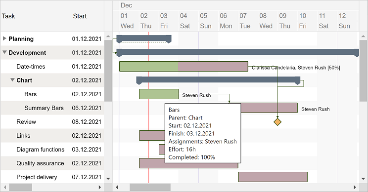
Appearance and bar templates
You may fully customize item appearance, either for the entire chart or for individual entries in the view, using CSS class mappings such as settings.standardBarClass, summaryBarClass, etc. (similar inline style settings are also available, if needed). Moreover, you may easily configure alternativeItemClass and alternativeChartItemClass settings for the grid and chart areas, and item.class and item.barClass fields also apply to the elements of any individual item that needs to be highlighted in the view.
When you need to develop advanced features in your timeline based application, chart bars may be fully redesigned using JavaScript® functions that generate SVG content set up as standardTaskTemplate, summaryTaskTemplate, and milestoneTaskTemplate settings of the component. Or, if you only want to add content on top of the default display, define extraTaskTemplate function instead.
settings.standardBarStyle = "stroke: Green; fill: LightGreen";
settings.standardCompletedBarStyle = "stroke: DarkGreen; fill: DarkGreen";
settings.dependencyLineStyle = "stroke: Green; fill: none; marker-end: url(#ArrowMarker)";
settings.alternativeItemStyle = "background-color: #f9f9f9"; settings.alternativeChartItemStyle: "fill: #f9f9f9";
items[i].barStyle = "stroke: Red; fill: #ffd54e";
settings.extraTaskTemplate = function (item) {
    document = item.ganttChartView.ownerDocument;
    var element = document.createElementNS(…, "http://www.w3.org/2000/svg");
    …
    return element; };
Demo
Printing and exporting
The component offers a print method that may be called to initiate a direct print operation for their content. Moreover, you can export HTML out of a component content by calling exportContent methods on the fly. Both methods support custom configurations, such as indicating which grid columns, row range, and timeline period to be included as output. Also, setting up rotate field of the argument settings to true enables direct landscape printing.
ganttChartView.print({ title: "Gantt Chart (printable)",
                       isGridVisible: true, columnIndexes: [1],
                       timelineStart: new Date(…), timelineFinish: new Date(…),
                       preparingMessage: "…" });
Server side image generation
If your solution has a server side tier based on Microsoft® .NET, you can get XML data from the HTML component and send it to GanttChartExporter component available with DlhSoft Project Management Framework, allowing you to export Gantt Chart images for that data, such as using PNG encoding, and redirect the client side to display or download the image bytes directly from there. The XML data to be passed to the exporter extension is obtained by calling getXml method of the ProjectSerializer component.
Hyper Library licensees can order a free license for Project Management Framework (or, for JavaScript® server scheduling, for Project Management Hyper Framework instead.)
Demo