DateTimePicker
for HTML5 and JavaScript® with optional TypeScript support and AngularJS extensions
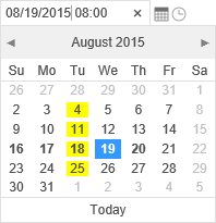
Run demo Demo source code NuGet packageDateTimePicker, DatePicker, TimePicker, and Calendar components provide user interface for displaying and selecting dates and times. Calendar component may display multiple months and supports date range selection. Picker controls use input elements and provide popups upon receiving focus. TimePicker allows selecting a time of day. DateTimePicker allows both date and time selection, providing a single value output. All components allow formatting and disabling selection on any specific date criteria through JavaScript® functions.