DataTreeGrid
for WPF & .NET 4+ / .NET Core 3.1 / .NET 5+ and Silverlight™ 4+
New: WPF .NET Core/.NET 5+ support: with NuGet!
DataTreeGrid component displays and manages indented item collections using a hierarchical data grid that inherits core features and behavior from Microsoft® DataGrid.
-
WPF +
C#Demo<hdc:DataTreeGrid x:Name="DataTreeGrid"> <hdc:DataTreeGrid.Columns> <hdc:DataTreeGridColumn Header="Node" /> <DataGridTextColumn Header="Indentation" Binding="{Binding Indentation}" IsReadOnly="True" /> <DataGridCheckBoxColumn Header="IsExpanded" Binding="{Binding IsExpanded}" IsReadOnly="True" /> … </hdc:DataTreeGrid.Columns> … </hdc:DataTreeGrid>var items = new ObservableCollection<DataTreeGridItem> { new DataTreeGridItem { Content = "Node 1" }, new DataTreeGridItem { Content = "Node 1.1", Indentation = 1 }, new DataTreeGridItem { Content = "Node 1.2", Indentation = 1 }, new DataTreeGridItem { Content = "Node 2" }, new DataTreeGridItem { Content = "Node 2.1", Indentation = 1 }, new DataTreeGridItem { Content = "Node 2.2", Indentation = 1 }, … }; DataTreeGrid.Items = items; … -
WPF +
Visual Basic®<hdc:DataTreeGrid x:Name="DataTreeGrid"> <hdc:DataTreeGrid.Columns> <hdc:DataTreeGridColumn Header="Node" /> <DataGridTextColumn Header="Indentation" Binding="{Binding Indentation}" IsReadOnly="True" /> <DataGridCheckBoxColumn Header="IsExpanded" Binding="{Binding IsExpanded}" IsReadOnly="True" /> … </hdc:DataTreeGrid.Columns> … </hdc:DataTreeGrid>Dim items = New ObservableCollection(Of DataTreeGridItem) From { _ New DataTreeGridItem With { .Content = "Node 1" }, _ New DataTreeGridItem With { .Content = "Node 1.1", .Indentation = 1 }, _ New DataTreeGridItem With { .Content = "Node 1.2", .Indentation = 1 }, _ New DataTreeGridItem With { .Content = "Node 2" }, _ New DataTreeGridItem With { .Content = "Node 2.1", .Indentation = 1 }, _ New DataTreeGridItem With { .Content = "Node 2.2", .Indentation = 1 }, _ … _ } DataTreeGrid.Items = items … -
Silverlight™ +
C#Demo<hdc:DataTreeGrid x:Name="DataTreeGrid"> <hdc:DataTreeGrid.Columns> <hdc:DataTreeGridColumn Header="Node" /> <d:DataGridTextColumn Header="Indentation" Binding="{Binding Indentation}" IsReadOnly="True" /> <d:DataGridCheckBoxColumn Header="IsExpanded" Binding="{Binding IsExpanded}" IsReadOnly="True" /> … </hdc:DataTreeGrid.Columns> … </hdc:DataTreeGrid>var items = new ObservableCollection<DataTreeGridItem> { new DataTreeGridItem { Content = "Node 1" }, new DataTreeGridItem { Content = "Node 1.1", Indentation = 1 }, new DataTreeGridItem { Content = "Node 1.2", Indentation = 1 }, new DataTreeGridItem { Content = "Node 2" }, new DataTreeGridItem { Content = "Node 2.1", Indentation = 1 }, new DataTreeGridItem { Content = "Node 2.2", Indentation = 1 }, … }; DataTreeGrid.Items = items; … -
Silverlight™ +
Visual Basic®<hdc:DataTreeGrid x:Name="DataTreeGrid"> <hdc:DataTreeGrid.Columns> <hdc:DataTreeGridColumn Header="Node" /> <d:DataGridTextColumn Header="Indentation" Binding="{Binding Indentation}" IsReadOnly="True" /> <d:DataGridCheckBoxColumn Header="IsExpanded" Binding="{Binding IsExpanded}" IsReadOnly="True" /> … </hdc:DataTreeGrid.Columns> … </hdc:DataTreeGrid>Dim items = New ObservableCollection(Of DataTreeGridItem) From { _ New DataTreeGridItem With { .Content = "Node 1" }, _ New DataTreeGridItem With { .Content = "Node 1.1", .Indentation = 1 }, _ New DataTreeGridItem With { .Content = "Node 1.2", .Indentation = 1 }, _ New DataTreeGridItem With { .Content = "Node 2" }, _ New DataTreeGridItem With { .Content = "Node 2.1", .Indentation = 1 }, _ New DataTreeGridItem With { .Content = "Node 2.2", .Indentation = 1 }, _ … _ } DataTreeGrid.Items = items …
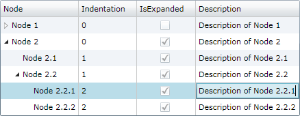
Items collection
To load and present data with DataTreeGrid control, initialize the Items collection of the component, setting up DataTreeGridItem objects representing nodes identified by these main properties: Indentation, and Content.
Parent nodes are determined by checking Indentation levels of subsequent items, and can be expanded or collapsed.
Move operations
Move, MoveUp, and MoveDown operations allow moving selected items in the hierarchy, with or without child items.
Performance
We have designed the component to achieve maximum runtime performance, loading and displaying thousands of items while remaining highly responsive. The control has IsAsyncPresentationEnabled property set to true by default, so asynchronous data loading is turned on unless you set it off manually. Moreover, since the component inherits from Microsoft®'s DataGrid, it comes with built-in virtualization features that further increase runtime performance when displaying large sets of data.
Data binding
Although we designed the component to support items of specific types only (DataTreeGridItem) to ensure high runtime performance, you may use our built-in collection converter (NodeItemsConverter) to set up data binding to custom collection types with ease. Alternatively, you can use a fully custom converter to provide collection synchronization upon your own needs.
The component is persistence layer independent, so you can bind it to data collections from virtually any data source, including but not limited to SQL Server® databases.
-
WPFBinding demo Custom converter demo
<hdc:DataTreeGrid>
    <hdc:DataTreeGrid.Items>
        <Binding>
            <Binding.Converter>
                <!-- Set *Member properties to identify custom item properties that need to be internally bound. -->
                <!-- Optionally, set UpdateTargetOnSourceChanges and/or UpdateSourceOnTargetChanges to true/false as needed. -->
                <hdc:NodeItemsConverter ContentMember="Name" IndentationMember="IndentLevel" />
            </Binding.Converter>
        </Binding>
    </hdc:DataTreeGrid.Items>
    <hdc:DataTreeGrid.Columns>
        <hdc:DataTreeGridColumn Header="Node" />
        <!-- Define new columns for custom properties, using Tag prefix to refer the original custom data item properties. -->
        <DataGridTextColumn Header="Description" Binding="{Binding Tag.Description, Mode=TwoWay}" IsReadOnly="False" />
    </hdc:DataTreeGrid.Columns>
</hdc:DataTreeGrid>
var items = new ObservableCollection<CustomNodeItem> { new CustomNodeItem { Name = "Node 1", Description = "Description of custom node 1" }, new CustomNodeItem { Name = "Node 1.1", IndentLevel = 1, Description = "Description of custom node 1.1" }, new CustomNodeItem { Name = "Node 1.2", IndentLevel = 1, Description = "Description of custom node 1.2" }, new CustomNodeItem { Name = "Node 2", Description = "Description of custom node 2" }, new CustomNodeItem { Name = "Node 2.1", IndentLevel = 1, Description = "Description of custom node 2.1" }, new CustomNodeItem { Name = "Node 2.2", IndentLevel = 1, Description = "Description of custom node 2.2" } }; DataContext = items; -
Silverlight™Binding demo Custom converter demo
<hdc:DataTreeGrid>
    <hdc:DataTreeGrid.Items>
        <Binding>
            <Binding.Converter>
                <!-- Set *Member properties to identify custom item properties that need to be internally bound. -->
                <!-- Optionally, set UpdateTargetOnSourceChanges and/or UpdateSourceOnTargetChanges to true/false as needed. -->
                <hdc:NodeItemsConverter ContentMember="Name" IndentationMember="IndentLevel" />
            </Binding.Converter>
        </Binding>
    </hdc:DataTreeGrid.Items>
    <hdc:DataTreeGrid.Columns>
        <hdc:DataTreeGridColumn Header="Node" />
        <!-- Define new columns for custom properties, using Tag prefix to refer the original custom data item properties. -->
        <d:DataGridTextColumn Header="Description" Binding="{Binding Tag.Description, Mode=TwoWay}" IsReadOnly="False" />
    </hdc:DataTreeGrid.Columns>
</hdc:DataTreeGrid>
var items = new ObservableCollection<CustomNodeItem> { new CustomNodeItem { Name = "Node 1", Description = "Description of custom node 1" }, new CustomNodeItem { Name = "Node 1.1", IndentLevel = 1, Description = "Description of custom node 1.1" }, new CustomNodeItem { Name = "Node 1.2", IndentLevel = 1, Description = "Description of custom node 1.2" }, new CustomNodeItem { Name = "Node 2", Description = "Description of custom node 2" }, new CustomNodeItem { Name = "Node 2.1", IndentLevel = 1, Description = "Description of custom node 2.1" }, new CustomNodeItem { Name = "Node 2.2", IndentLevel = 1, Description = "Description of custom node 2.2" } }; DataContext = items;
Grid columns, row filtering, sorting, and changes
You may customize the column collection of the grid by adding or redesigning data bound and cell template based columns. You may sort and filter items out hierarchically using Sort method of the component and by setting item.IsHidden values to true.
To be notified when items managed by the component change, simply handle the ItemCollectionChanged and ItemPropertyChanged events.