
OrganizationalChartView component for WPF 4.5 displays and manages indented item collections using a dynamically adapting Organization Chart view with behavior similar to that of Microsoft® TreeView.
-
C#Demo
<occ:OrganizationalChartView x:Name="OrganizationalChartView">
    …
</occ:OrganizationalChartView>
var items = new ObservableCollection<OrganizationalChartItem> { new OrganizationalChartItem { Content = "Node 1" }, new OrganizationalChartItem { Content = "Node 1.1", Indentation = 1 }, new OrganizationalChartItem { Content = "Node 1.2", Indentation = 1 }, new OrganizationalChartItem { Content = "Node 2" }, new OrganizationalChartItem { Content = "Node 2.1", Indentation = 1 }, new OrganizationalChartItem { Content = "Node 2.2", Indentation = 1 }, … }; OrganizationalChartView.Items = items; … -
Visual Basic®
    <occ:OrganizationalChartView x:Name="OrganizationalChartView">
    …
</occ:OrganizationalChartView>
Dim items = New ObservableCollection(Of OrganizationalChartItem) From { _ New OrganizationalChartItem With { .Content = "Node 1" }, _ New OrganizationalChartItem With { .Content = "Node 1.1", .Indentation = 1 }, _ New OrganizationalChartItem With { .Content = "Node 1.2", .Indentation = 1 }, _ New OrganizationalChartItem With { .Content = "Node 2" }, _ New OrganizationalChartItem With { .Content = "Node 2.1", .Indentation = 1 }, _ New OrganizationalChartItem With { .Content = "Node 2.2", .Indentation = 1 }, _ … _ } OrganizationalChartView.Items = items …
Items collection
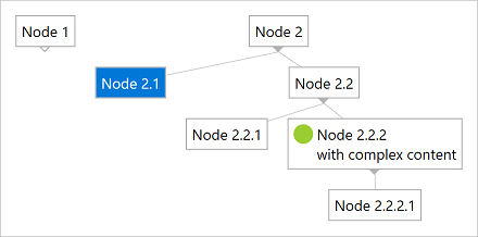
To load and present data with OrganizationalChartView control, initialize the Items collection of the component, setting up OrganizationalChartItem objects representing nodes identified by these main properties: Indentation, Content, and IsSelected.
Parent nodes are determined by checking Indentation levels of subsequent items, and can be expanded or collapsed. Content may be assigned to any complex WPF element tree as needed. IsSelected property may be used to initialize node selection in the view.
Dyanmic interface
When the end user collapses or expands nodes, and as well when you add, remove, or hide nodes in the view using custom code, the user interface of the component automatically adapts its internal size to display the hierarchy in the optimal way.
Data binding
Although we designed the component to support items of specific types only (OrganizationalChartItem) to ensure high runtime performance, you may use our built-in collection converter (NodeItemsConverter) to set up data binding to custom collection types with ease. Alternatively, you can use a fully custom converter to provide collection synchronization upon your own needs.
The component is persistence layer independent, so you can bind it to data collections from virtually any data source, including but not limited to SQL Server® databases.
<occ:OrganizationalChartView>
    <occ:OrganizationalChartView.Items>
        <Binding>
            <Binding.Converter>
                <!-- Set *Member properties to identify custom item properties that need to be internally bound. -->
                <!-- Optionally, set UpdateTargetOnSourceChanges and/or UpdateSourceOnTargetChanges to true/false as needed. -->
                <occ:NodeItemsConverter ContentMember="Name" IndentationMember="IndentLevel" />
            </Binding.Converter>
        </Binding>
    </occ:OrganizationalChartView.Items>
    <!-- Optionally customize the item template for organizational chart nodes. -->
    <occ:OrganizationalChartView.ItemTemplate>
        <DataTemplate>
            <StackPanel>
                <TextBlock Text="{Binding Content}"/>
                <!-- Use "Tag." prefix to bind to custom item properties. -->
                <TextBlock Text="{Binding Tag.Description}"/>
            </StackPanel>
        </DataTemplate>
    </occ:OrganizationalChartView.ItemTemplate>
</occ:OrganizationalChartView>
var items = new ObservableCollection<CustomNodeItem>
{
    new CustomNodeItem { Name = "Node 1", Description = "Description of custom node 1" },
    new CustomNodeItem { Name = "Node 1.1", IndentLevel = 1, Description = "Description of custom node 1.1" },
    new CustomNodeItem { Name = "Node 1.2", IndentLevel = 1, Description = "Description of custom node 1.2" },
    new CustomNodeItem { Name = "Node 2", Description = "Description of custom node 2" },
    new CustomNodeItem { Name = "Node 2.1", IndentLevel = 1, Description = "Description of custom node 2.1" },
    new CustomNodeItem { Name = "Node 2.2", IndentLevel = 1, Description = "Description of custom node 2.2" }
};
DataContext = items;