
ScheduleChartView
for HTML5 and JavaScript® with optional TypeScript support and Angular, React & Vue extensions
Angular 8, React & Vue components: within downloadable package (.zip)
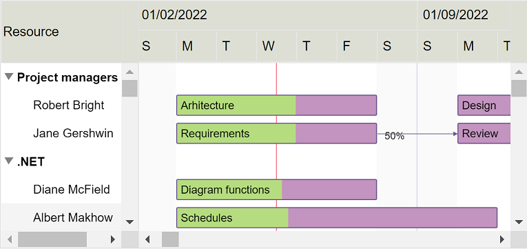
ScheduleChartView component displays and manages resource assignments using a data grid and an attached interactive Gantt Chart displaying multiple task bars on the same resource line and accepting horizontal and vertical drag and drop operations for scheduling task bars and changing assignments. Supports custom appearance settings for tasks for the entire chart or for individual items, as needed, inheriting core features and behavior from GanttChartView component.
-
JavaScript®
Demovar scheduleChartView = document.getElementById("scheduleChartView"); var items = [{ content: "Resource 1", …, ganttChartItems: [{ content: "Task 1", start: new Date(…), finish: new Date(…), … }, { content: "Task 2", start: new Date(…), finish: new Date(…), … }, …] }, { content: "Resource 2", …, ganttChartItems: [{ content: "Task 3", start: new Date(…), finish: new Date(…), … }, …] }, …]; var settings = { … }; DlhSoft.Controls.ScheduleChartView.initialize(scheduleChartView, items, settings); … scheduleChartView.refresh(); -
TypeScript
/// <reference path='./DlhSoft.ProjectData.GanttChart.HTML.Controls.d.ts' /> import ScheduleChartView = DlhSoft.Controls.ScheduleChartView; import ResourceItem = ScheduleChartView.Item; var scheduleChartViewElement = document.getElementById("scheduleChartView"); var items = <ResourceItem[]>[ { content: "Resource 1", …, ganttChartItems: [{ content: "Task 1", start: new Date(…), finish: new Date(…), … }, { content: "Task 2", start: new Date(…), finish: new Date(…), … }, …] }, { content: "Resource 2", …, ganttChartItems: [{ content: "Task 3", start: new Date(…), finish: new Date(…), … }, …] }, …]; var settings = <ScheduleChartView.Settings>{ … }; var scheduleChartView = ScheduleChartView.initialize(scheduleChartViewElement, items, settings); … scheduleChartView.refresh(); -
AngularJS
<!-- AngularJS module dependency: DlhSoft.ProjectData.GanttChart.Directives -->
<ds:schedule-chart items="items" settings="settings" auto-refresh="{{ true }}">
    …
</ds:schedule-chart>
$scope.items = [{ content: "Resource 1", …, ganttChartItems: [{ content: "Task 1", start: new Date(…), finish: new Date(…), … }, { content: "Task 2", start: new Date(…), finish: new Date(…), … }, …] }, { content: "Resource 2", …, ganttChartItems: [{ content: "Task 3", start: new Date(…), finish: new Date(…), … }, …] }, …]; $scope.settings = { … }; -
Angular 8
<!-- Dependencies: DlhSoft.ProjectData.GanttChart.HTML.Controls, DlhSoft.ProjectData.GanttChart.Angular.Components -->
<schedulechartview [items]="items" [settings]="settings">
    …
</schedulechartview>
import ResourceItem = ScheduleChartView.Item; var items = <ResourceItem[]>[ { content: "Resource 1", …, ganttChartItems: [{ content: "Task 1", start: new Date(…), finish: new Date(…), … }, { content: "Task 2", start: new Date(…), finish: new Date(…), … }, …] }, { content: "Resource 2", …, ganttChartItems: [{ content: "Task 3", start: new Date(…), finish: new Date(…), … }, …] }, …]; … this.items = items; this.settings = { … }; -
React
// Dependencies: DlhSoft.ProjectData.GanttChart.HTML.Controls, DlhSoft.ProjectData.GanttChart.React.Components var items = [ { content: "Resource 1", …, ganttChartItems: [{ content: "Task 1", start: new Date(…), finish: new Date(…), … }, { content: "Task 2", start: new Date(…), finish: new Date(…), … }, …] }, { content: "Resource 2", …, ganttChartItems: [{ content: "Task 3", start: new Date(…), finish: new Date(…), … }, …] }, …]; … return <ScheduleChartView items={items} settings={settings}>…</ScheduleChartView>; -
Vue
<!-- Dependencies: DlhSoft.ProjectData.GanttChart.HTML.Controls, DlhSoft.ProjectData.GanttChart.Vue.Components -->
<schedule-chart v-bind:items="items" v-bind:settings="settings">
    …
</schedule-chart>
var items = [ { content: "Resource 1", …, ganttChartItems: [{ content: "Task 1", start: new Date(…), finish: new Date(…), … }, { content: "Task 2", start: new Date(…), finish: new Date(…), … }, …] }, { content: "Resource 2", …, ganttChartItems: [{ content: "Task 3", start: new Date(…), finish: new Date(…), … }, …] }, …]; … var app = new Vue({ el: …, data: { items: items, settings: {…} } });
Items collection
To load and present data with ScheduleChartView control, initialize the items collection of the component, setting up objects representing resource rows identified by these main fields: content, and ganttChartItems. Gantt Chart items collection defines timeline assignments and are identified by these fields: content, start, finish, completedFinish, isMilestone, and assignmentsContent.
Standard items are presented as rectangular bars, and milestones as special diamond shapes in the view. Date values of start and finish may be initialized using Date objects, but JSON-formatted string values are also supported. Completion rate of a standard item is determined by evaluating completedFinish value, representing the date and time up to which the effort is currently considered completed. By convention, assignmentsContent value may be a string that specifies the allocation units in this format: 50%.
Note that you can also prepare items for ScheduleChartView component from a GanttChartView instance using getScheduleChartItems method.
var items = [{ content: "Resource 1",
               ganttChartItems: [{ content: "Task A (Resource 1)",
                                   start: new Date(year, month, 2, 8, 0, 0), finish: new Date(year, month, 8, 16, 0, 0),
                                   completedFinish: new Date(year, month, 5, 16, 0, 0) }] },
             { content: "Resource 2",
               ganttChartItems: [{ content: "Task A (Resource 2)",
                                   start: new Date(year, month, 2, 8, 0, 0), finish: new Date(year, month, 8, 16, 0, 0),
                                   completedFinish: new Date(year, month, 5, 16, 0, 0), assignmentsContent: "50%" },
                                 { content: "Task B (Resource 2)",
                                   start: new Date(year, month, 11, 8, 0, 0), finish: new Date(year, month, 12, 16, 0, 0),
                                   completedFinish: new Date(year, month, 12, 16, 0, 0) },
                                 { content: "Task C (Resource 2)",
                                   start: new Date(year, month, 14, 8, 0, 0), finish: new Date(year, month, 14, 16, 0, 0) }] },
             { content: "Resource 3",
               ganttChartItems: [{ content: "Task D (Resource 3)",
                                   start: new Date(year, month, 12, 12, 0, 0), finish: new Date(year, month, 14, 16, 0, 0) }] }];
DlhSoft.Controls.ScheduleChartView.initialize(scheduleChartView, items, settings);
var items = ganttChartView.getScheduleChartItems();
DlhSoft.Controls.ScheduleChartView.initialize(scheduleChartView, items, settings);
Drag and drop
End users may use horizontal drag and drop operations to reschedule bars, update start, finish and completion values independently. By hovering the bottom area of an assignment bar, end users may also use vertical drag and drop operations to modify resource assignments of tasks. By moving an assignment bar from one row to another, the task is assigned to a different resource item, maintaining the optionally specified allocation units of the slot.
Performance
We have designed the component to achieve maximum runtime performance, loading and displaying thousands of items while remaining highly responsive. Item loading is always asynchronous as the control has the virtualization feature (isVirtualizing field) turned on by default.
Timeline and calendars
You may configure timeline duration, visible and working days and hours, scales, update interval (for drag and drop operations), and zoom level (width of an hour) in the view. The component can further be zoomed in and out by moving the mouse wheel. Special nonworking days may be defined as a simple array of Date objects.
You can also configure working and nonworking time for individual Gantt Chart items, when needed, using Schedule objects. Actually, a general calendar may also be provided this way, by setting the schedule field of the component settings. An individual task item may have more or less working time than configured at view level, and therefore they will behave differently when setting start and finish values, including when using drag and drop update operations.
settings.timelineStart = start; settings.timelineFinish = finish;
settings.visibleWeekStart = 1; settings.visibleWeekFinish = 5; // Mon-Fri
settings.workingWeekStart = 1; settings.workingWeekFinish = 4; // Mon-Thu
settings.workingDayStart = 10 * hourDuration; settings.workingDayFinish = 19 * hourDuration; // 10-19
settings.scales = [ { scaleType: "Months"; headerTextFormat: "Month", … } ];
settings.updateScale = 15 * minuteDuration;
settings.hourWidth = 5;
settings.specialNonworkingDays = [ new Date(…), … ];
settings.schedule = { workingWeekStart: 1, workingWeekFinish: 5, … }; // Mon-Fri
ganttChartItem.schedule = { workingWeekStart: 2, workingWeekFinish: 6, … }; // Tue-Sat
Grid columns, rows, and changes
You may customize the column collection of the grid by resetting it or by adding and removing built-in columns and optionally defining new ones using JavaScript® functions initialized as column.cellTemplate. You may also filter items out by setting item.isHidden values to true and refreshing the user interface. To be notified when items managed by the component change either by editing grid cells or within the chart area, simply provide a handler function for settings.itemPropertyChanged.
settings.isGridVisible = true;
settings.gridWidth = settings.chartWidth = "50%";
settings.columns = [
    { …,
      cellTemplate: function (item) {
          document = control.ownerDocument;
          var element = document.createElement(…);
          …
          return element; } },
    …];
settings.itemPropertyChangeHandler =
    function (item, propertyName, isDirect, isFinal) { … };
Appearance and bar templates
You may fully customize item appearance, either for the entire chart or for individual entries in the view, using CSS class mappings such as settings.standardBarClass, summaryBarClass, etc. (similar inline style settings are also available, if needed). Moreover, you may easily configure alternativeItemClass and alternativeChartItemClass settings for the grid and chart areas, and item.class and item.barClass fields also apply to the elements of any individual item that needs to be highlighted in the view.
When you need to develop advanced features in your timeline based application, chart bars may be fully redesigned using JavaScript® functions that generate SVG content set up as standardTaskTemplate, and milestoneTaskTemplate settings of the component. Or, if you only want to add content on top of the default display, define extraTaskTemplate function instead.
settings.extraTaskTemplate = function (item) {
    document = item.ganttChartView.ownerDocument;
    var element = document.createElementNS(…, "http://www.w3.org/2000/svg");
    …
    return element; };
Printing and exporting
The component offers a print method that may be called to initiate a direct print operation for their content. Moreover, you can export HTML out of a component content by calling exportContent methods on the fly. Both methods support custom configurations, such as indicating which grid columns, row range, and timeline period to be included as output. Also, setting up rotate field of the argument settings to true enables direct landscape printing.
settings.standardBarStyle = "stroke: Green; fill: LightGreen";
settings.standardCompletedBarStyle = "stroke: DarkGreen; fill: DarkGreen";
settings.alternativeItemStyle = "background-color: #f9f9f9"; settings.alternativeChartItemStyle: "fill: #f9f9f9";
items[i].ganttChartItems[j].barStyle = "stroke: Red; fill: #ffd54e";
scheduleChartView.print({ title: "Schedule Chart (printable)",
                          isGridVisible: true, columnIndexes: [1],
                          timelineStart: new Date(…), timelineFinish: new Date(…),
                          preparingMessage: "…" });